 Basquiat- Book Covers
 Yoko Matcha
 Delete Where Applicable
 Visualizing DataBasquiat- Book CoversYoko MatchaDelete Where ApplicableVisualizing Data
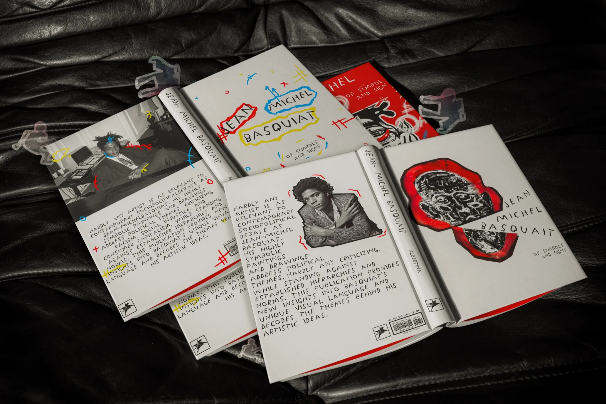
Basquiat- Book Covers. Every line, every colour, can be transformed to bring in life and energy. Basquiat has proven time and time again, through his work, that art can be expressive and unconventional. Take a look at the streets and how it works so well with Basquiat’s principles.
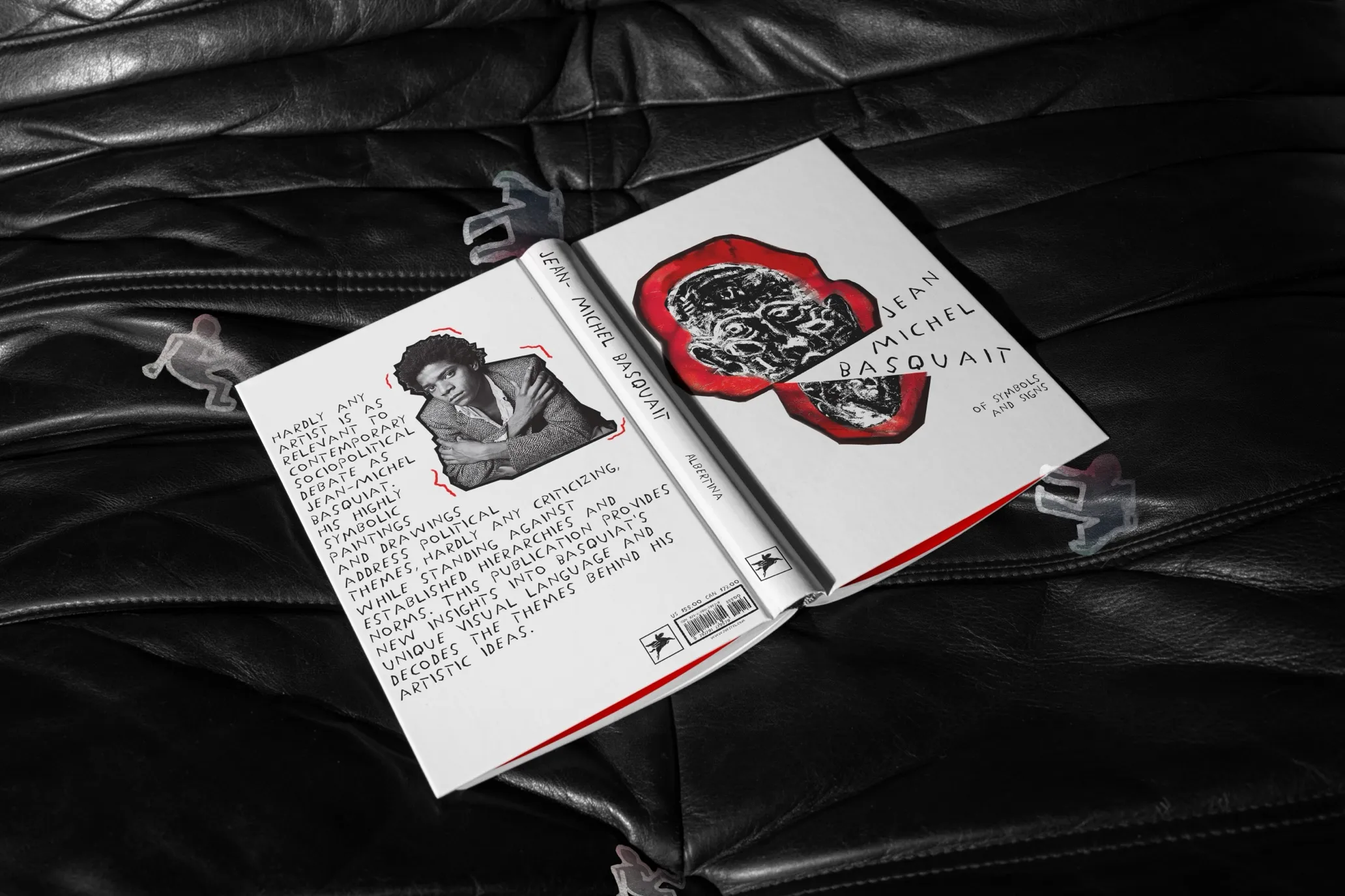
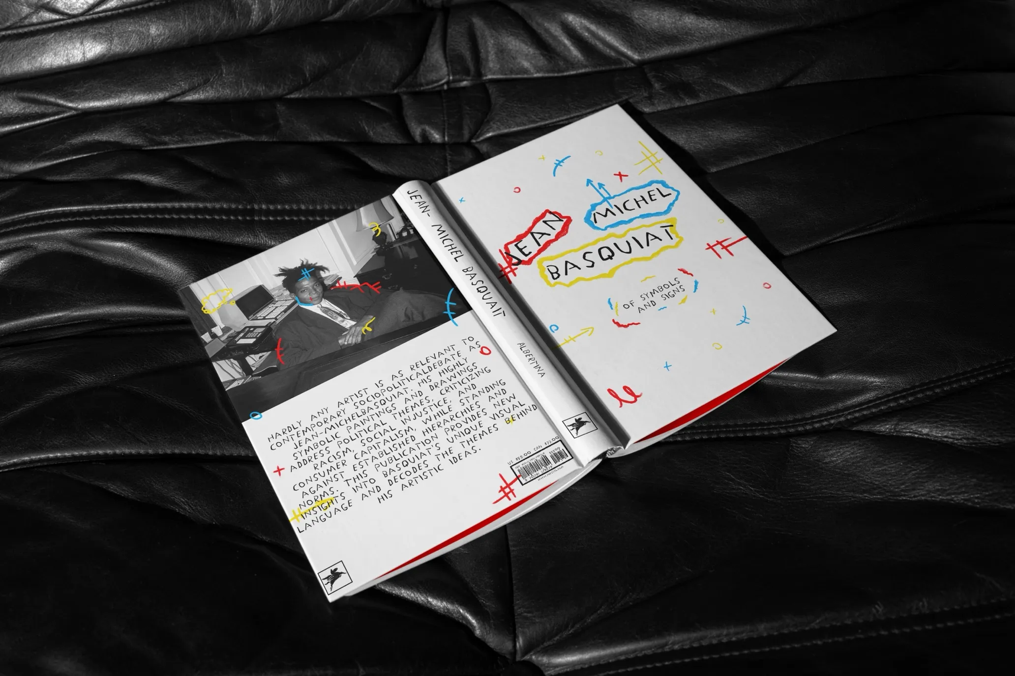

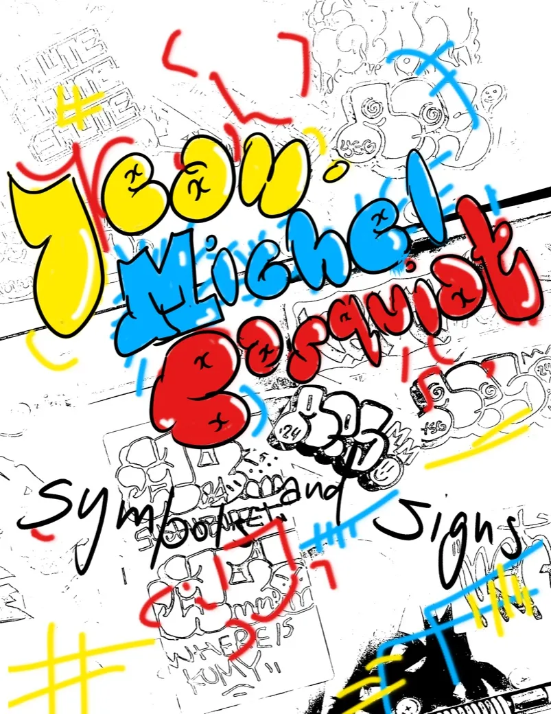
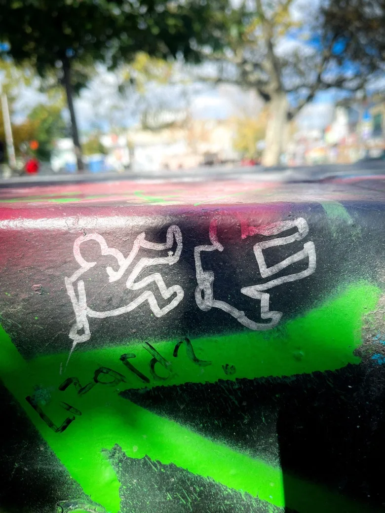
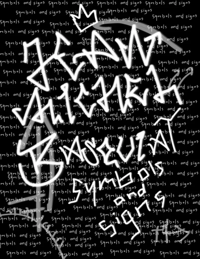
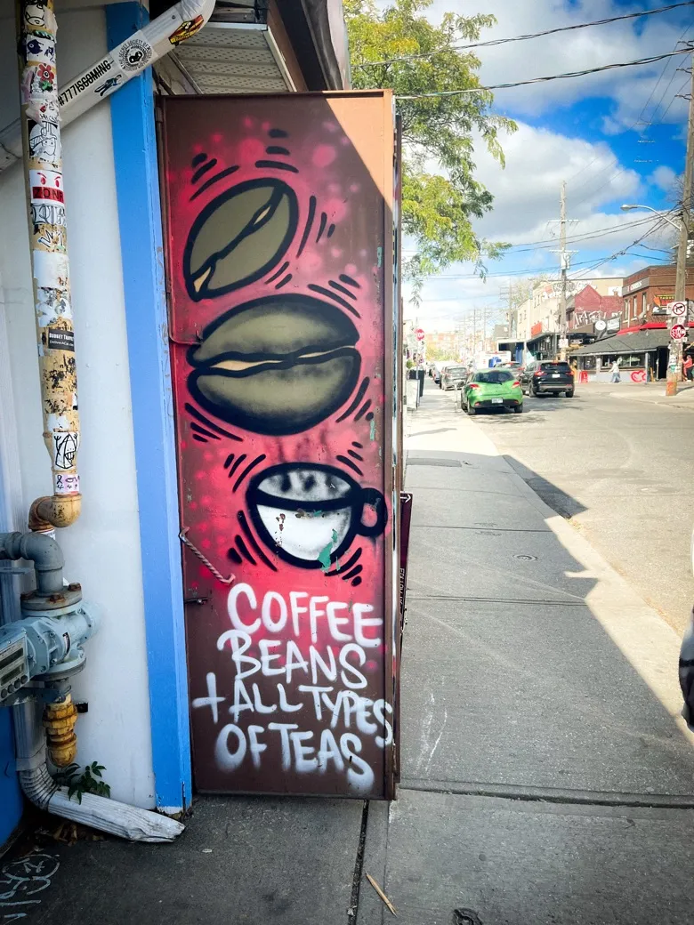
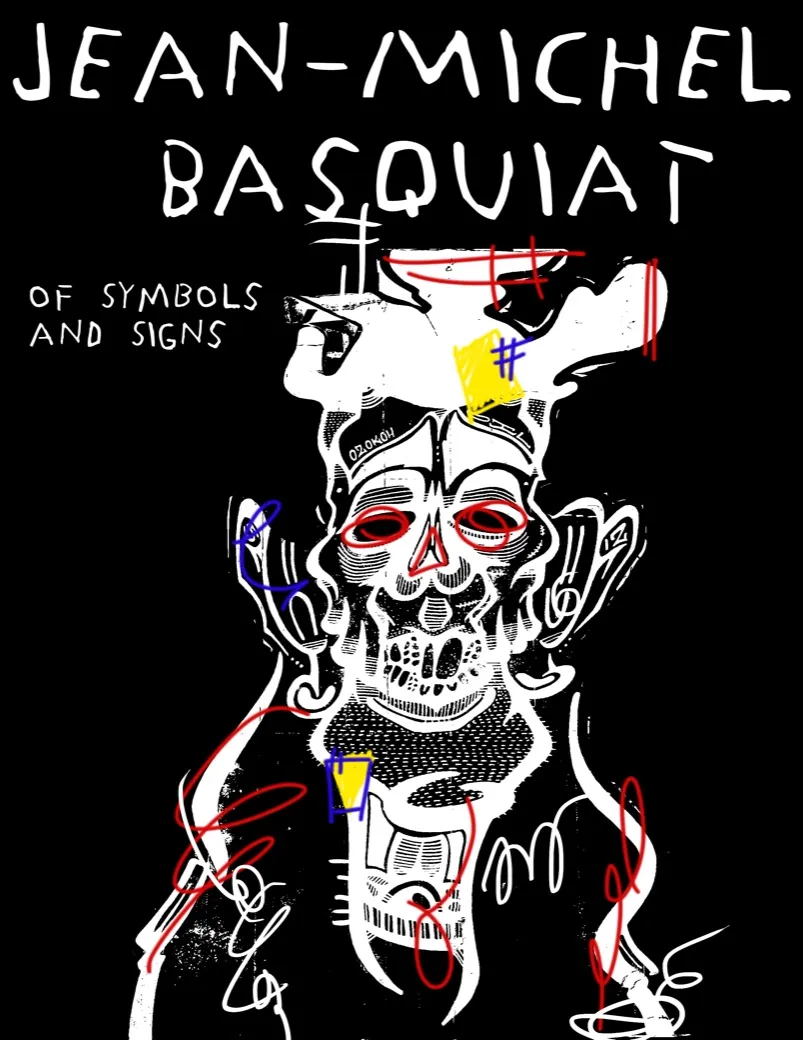
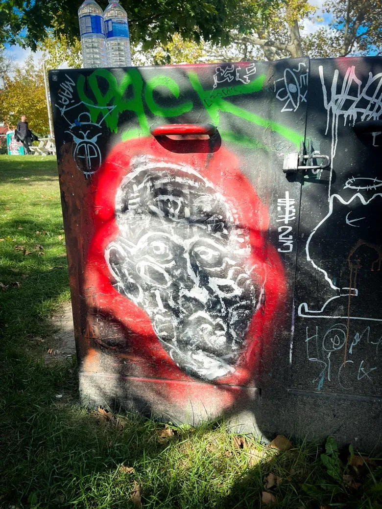
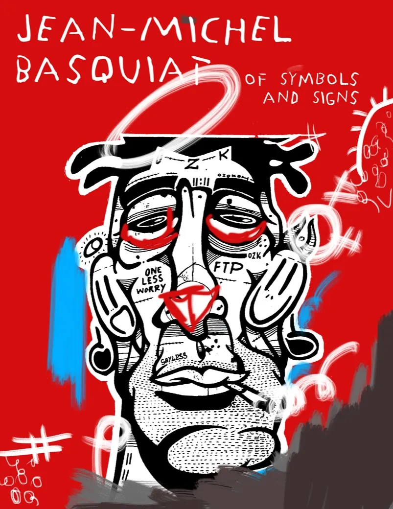
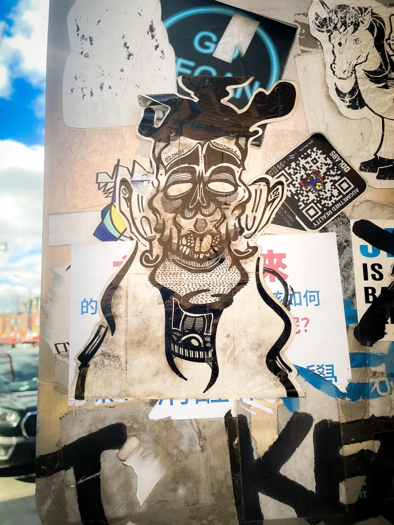
Redesign two book covers for Jean-Michel Basquiat: Of Symbols and Signs, one type-based and one image-based. Each cover had to feel distinct while staying true to Basquiat's visual language.
Basquiat's work is loud, expressive, political, and deeply personal. His work is built on raw mark-making, street culture, primary colours, and handwritten text; nothing formal, nothing polished for politeness. The original cover's typography felt like it belonged to a different artist entirely.
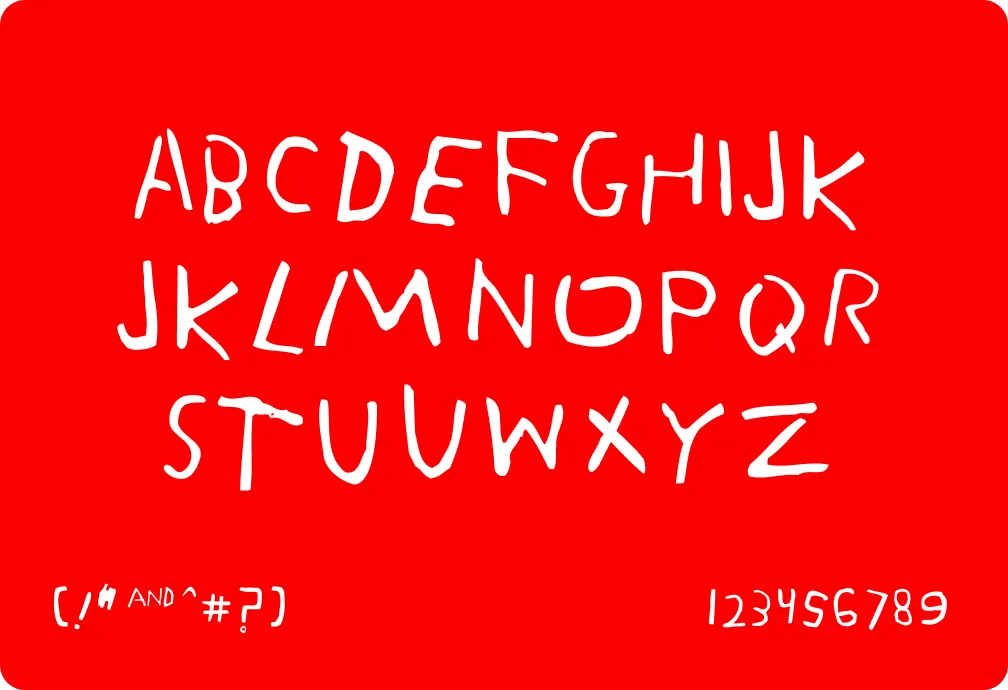
One of the main issues I had with the original book cover was the typography. The font used was very strong and formal, which did not convey the intended feeling. When I think of Basquiat and his work, I think of very loud and expressive art; nothing close to being formal or rigid. This inspired me to convey that message using typography in the cover. I started with a Basquiat-inspired font built from his handwriting, and then created the “loud expressions” through the colours and doodles he uses throughout his work. Since I still wanted the text to be the main focus, I used graphics to emphasize it. To keep cohesion throughout the book, I drew the doodles on the spine and back cover as well.
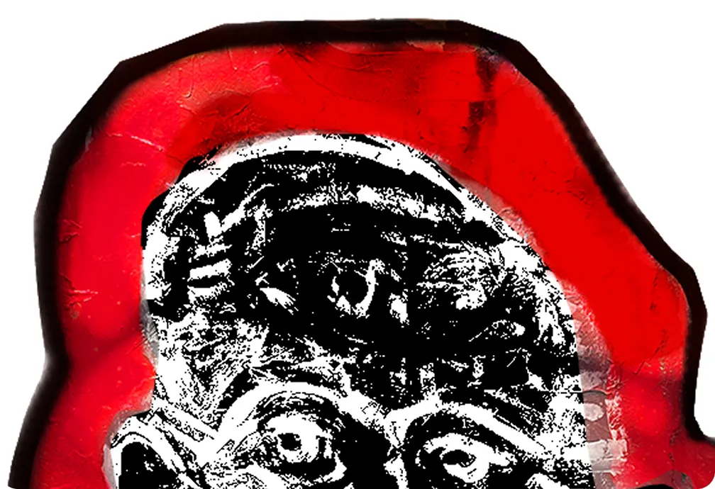
Reflecting on Basquiat’s work, he uses a lot of lines and sometimes has graffiti or street style that he uses in his art. Using actual graffiti of a face I found in the streets of downtown Toronto, I decided to incorporate it into my cover. I wanted it to be loud and in your face. To put my own spin on it, I tried to make it look like a collage, as if it were paper pasted onto another. I continued this theme with the graphics on the back cover. I wanted to keep that informal text he uses but also keep a simple background as the images themselves were loud enough.
This project didn't feel like work. There was no rigid plan, no predetermined steps, no dread, just starting and then not being able to stop. Both covers ultimately make the same argument in different ways: that authenticity and intention aren't opposites. The type cover channels Basquiat's visual vocabulary directly through his marks, his colours, his handwriting, while the image cover finds that same spirit on Toronto's streets, suggesting that what Basquiat was doing wasn't so different from what anonymous artists do on city walls every day. Neither one was made with an agenda. It was creativity for its own sake.
By: Rudaina Suwaiba
Using: Photoshop + InDesign
In November of 2024
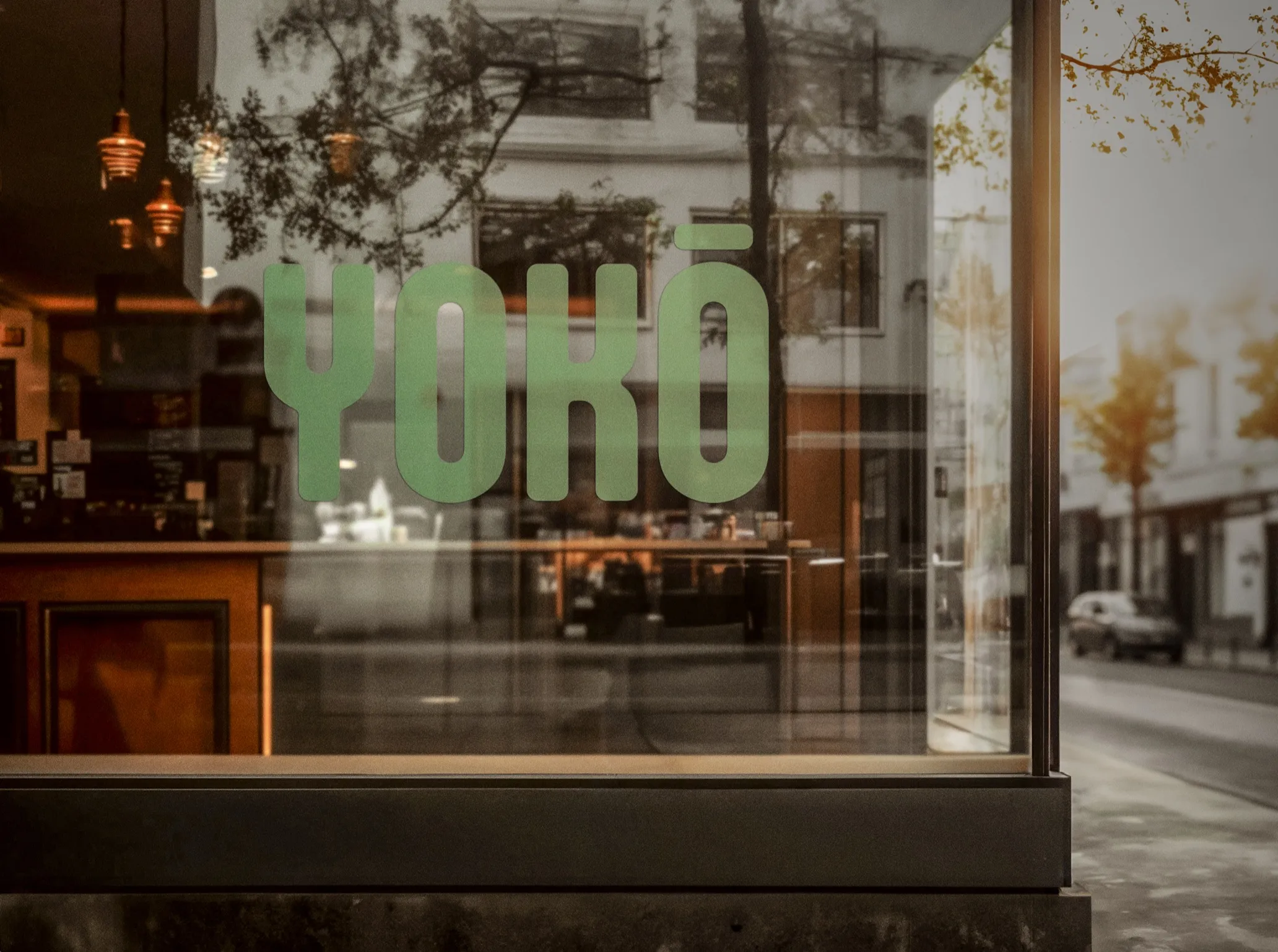
Yoko Matcha. In a fast paced city, the moments that are grounded are so cherished. Matcha is born in remote and quiet farm, bringing in tranquility with every sip. Enjoy the slow moments, even through the hustle culture.
Branding
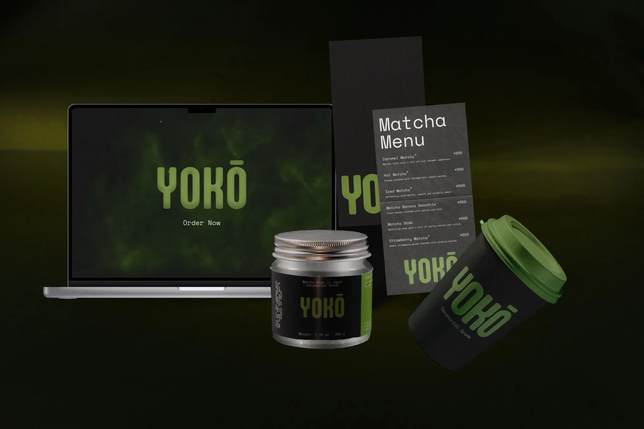
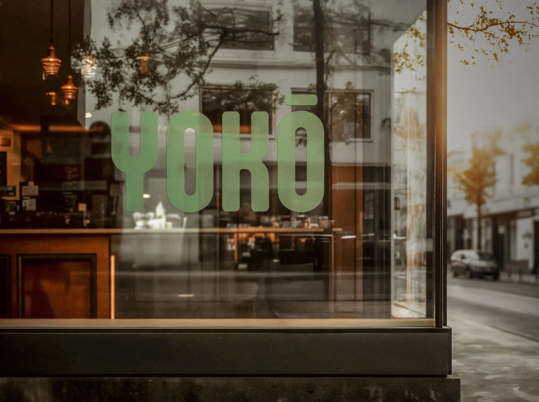
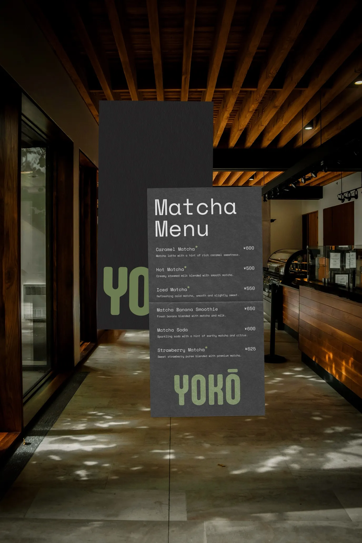
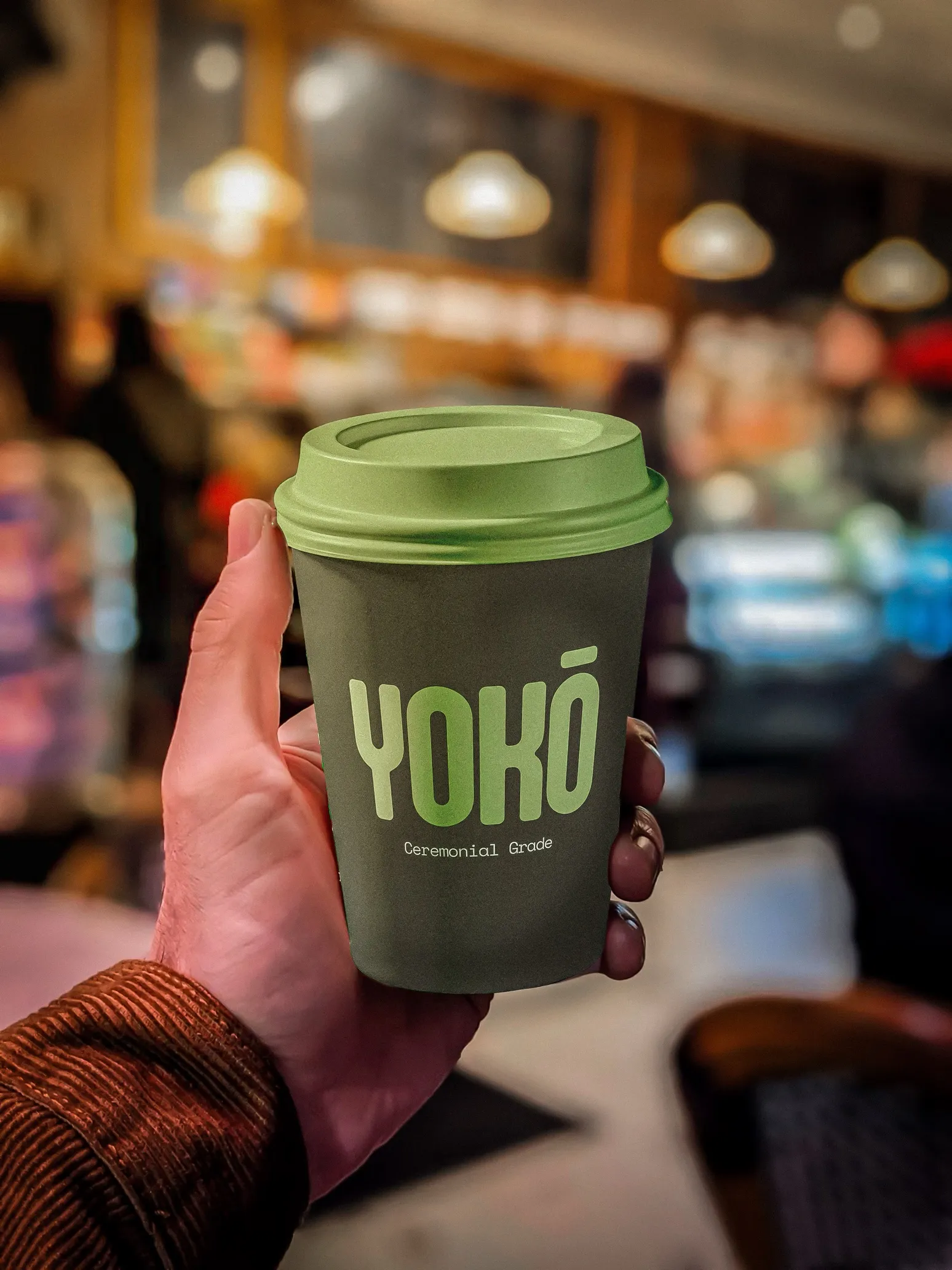
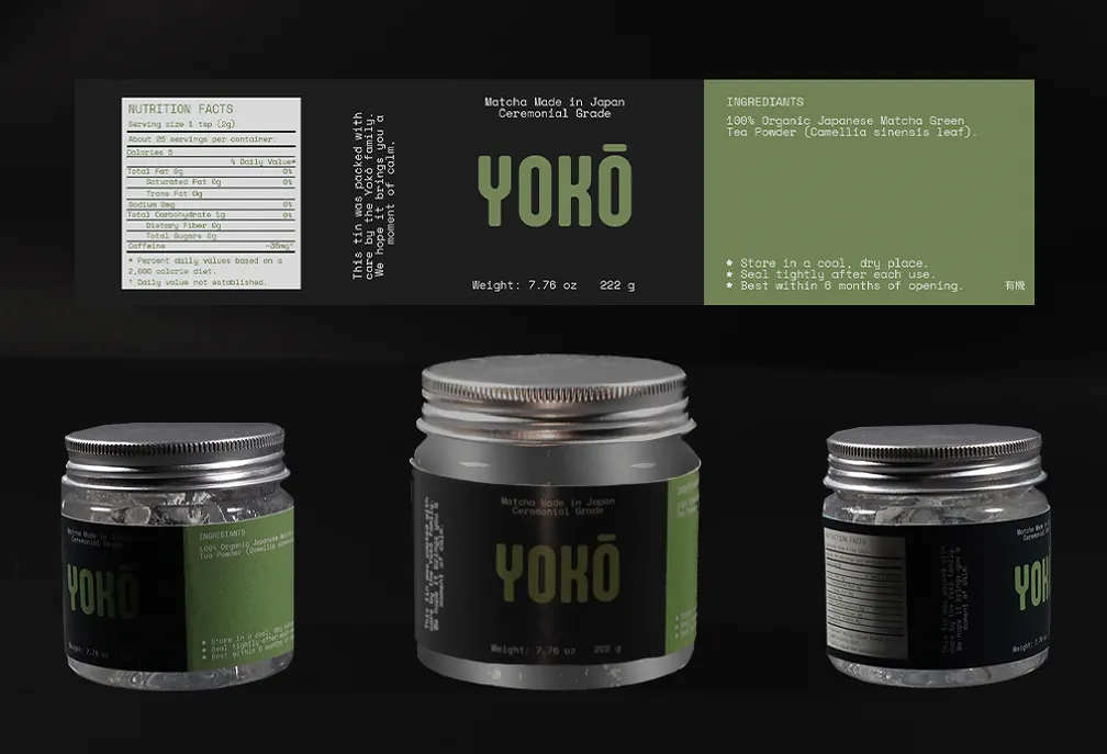
Design a brand identity and menu card for Yokō, a Japanese matcha café inspired by Tokyo's quiet side streets and fast-paced city life.
Matcha is a rural, harvested product. Slow, ceremonial, and deeply tied to nature. The brief asked for a brand that could hold that origin while living in an urban environment. Feeling the tension between those two worlds became the design direction I chose.
As my first branding project, it was a fun challenge to find ways to build a brand. The big question was, how do you translate something as earthy and slow as matcha into a visual language that belongs in the city without losing its soul?
The dark palette does the heavy lifting here and reads as industrial, urban texture, the kind of café tucked into a Tokyo backstreet. However, the green still stands out unmistakably as matcha. It's the countryside brought into the city without softening it.
Besides the colours, the typefaces were the main highlight. Aptly Bold, was the prominent twist. Wide, rounded, almost playful, it contrasts the seriousness of the dark palette in the same way matcha contrasts its setting; something natural and light-hearted surviving in a fast environment. It also made a standalone wordmark possible; the type is the identity.
Space Mono for body text reinforces the urban, practical side; a monospaced type carries a quiet industrial energy that grounds the warmer elements of the café interior.
By: Rudaina Suwaiba
Using: Figma + Photoshop + Illustrator + Lightroom
In July of 2025
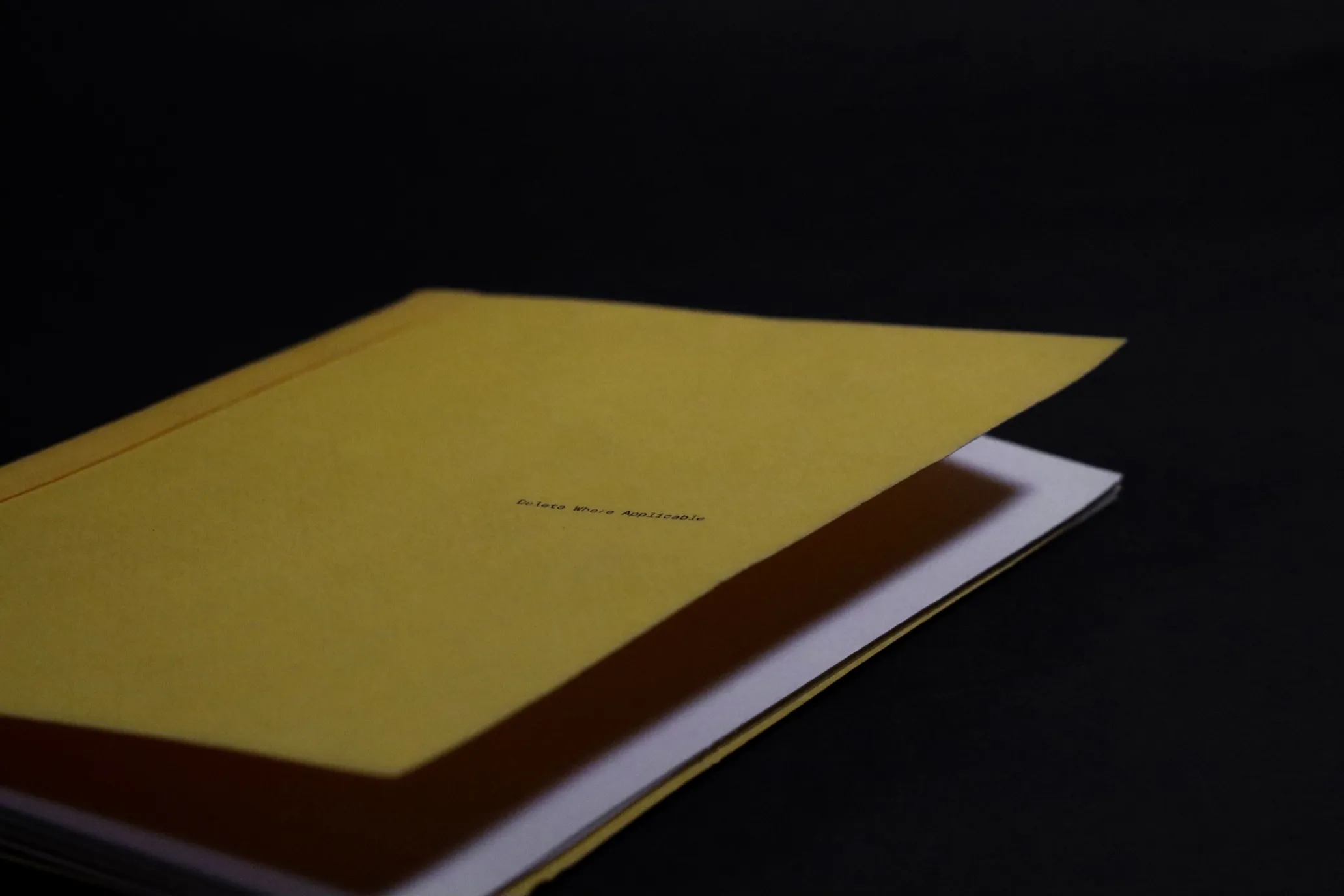
Delete Where Applicable. The art of simplicity and slowing down changes over time. Let us travel back to the 20th century, where luxuries were limited. Photographs were reduced to the essence of memory. Cut the noise, colour, and distractions; find purpose in the core of the output.
Publication
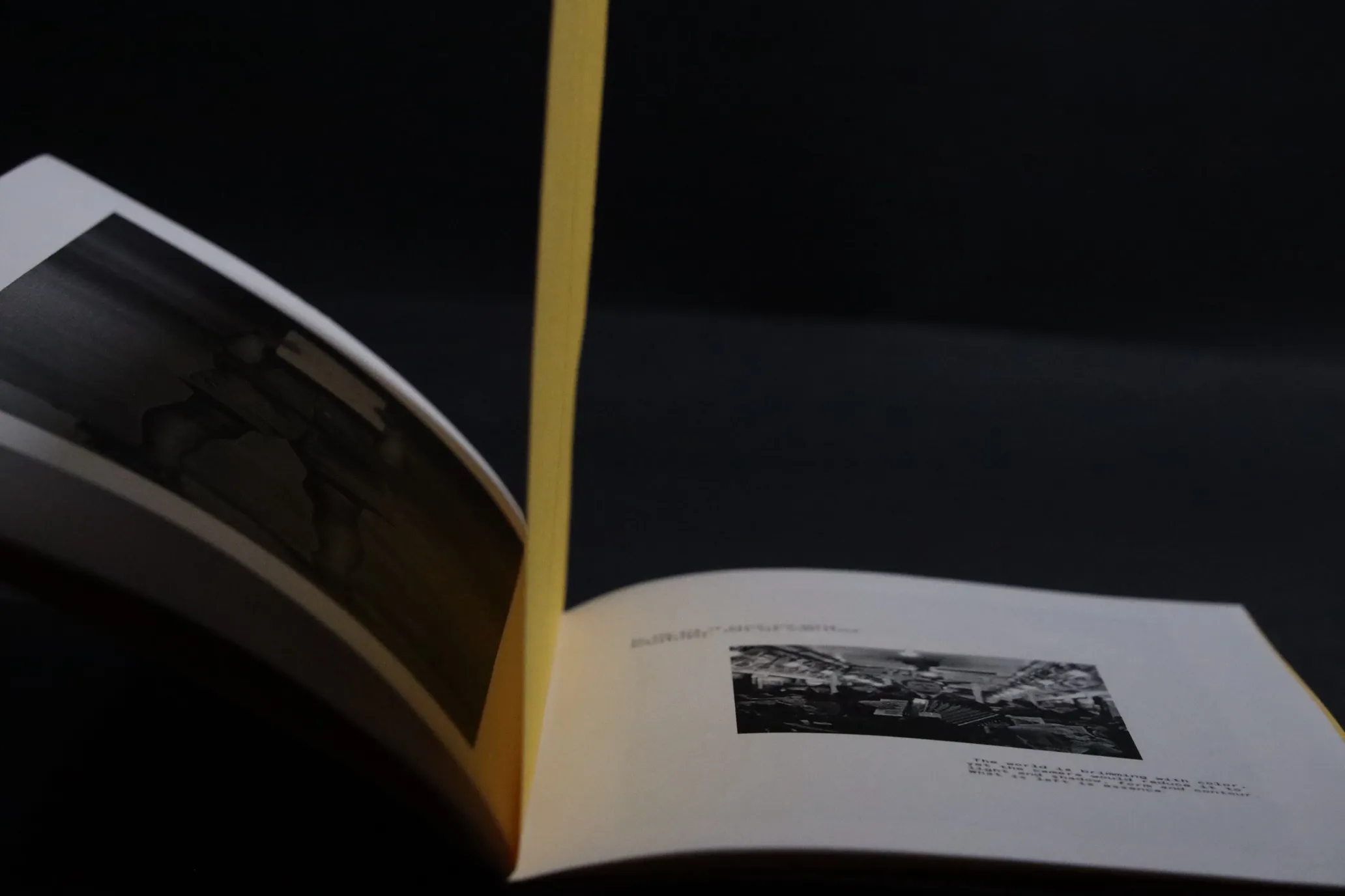
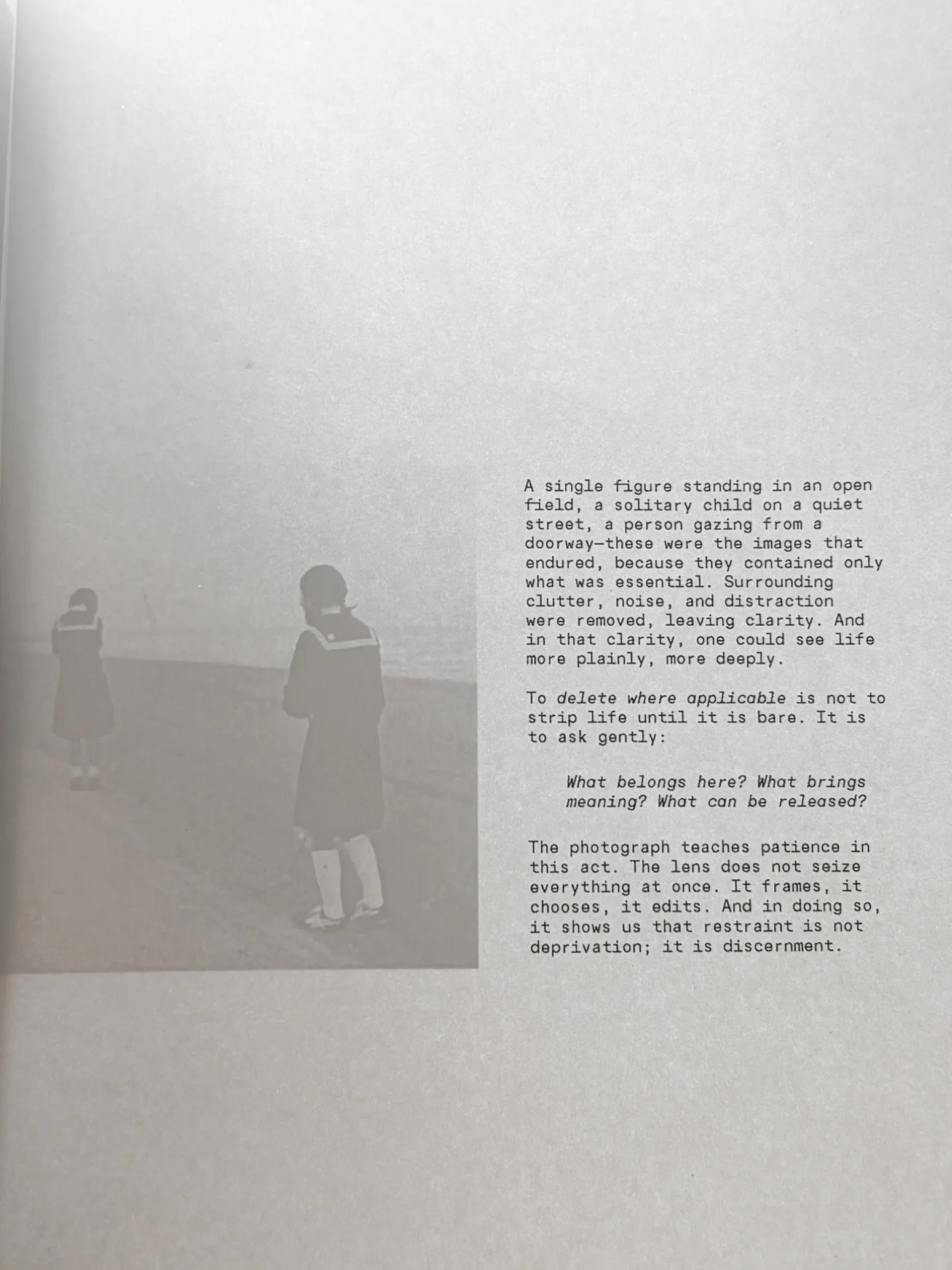
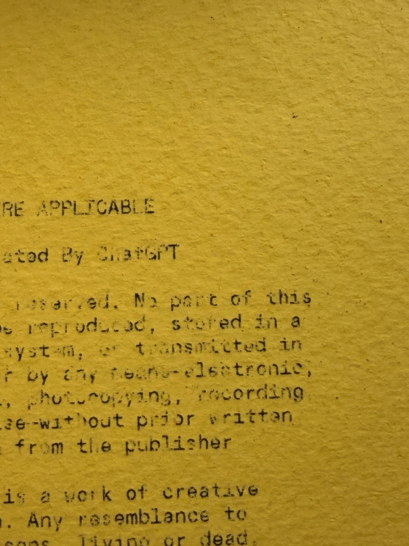
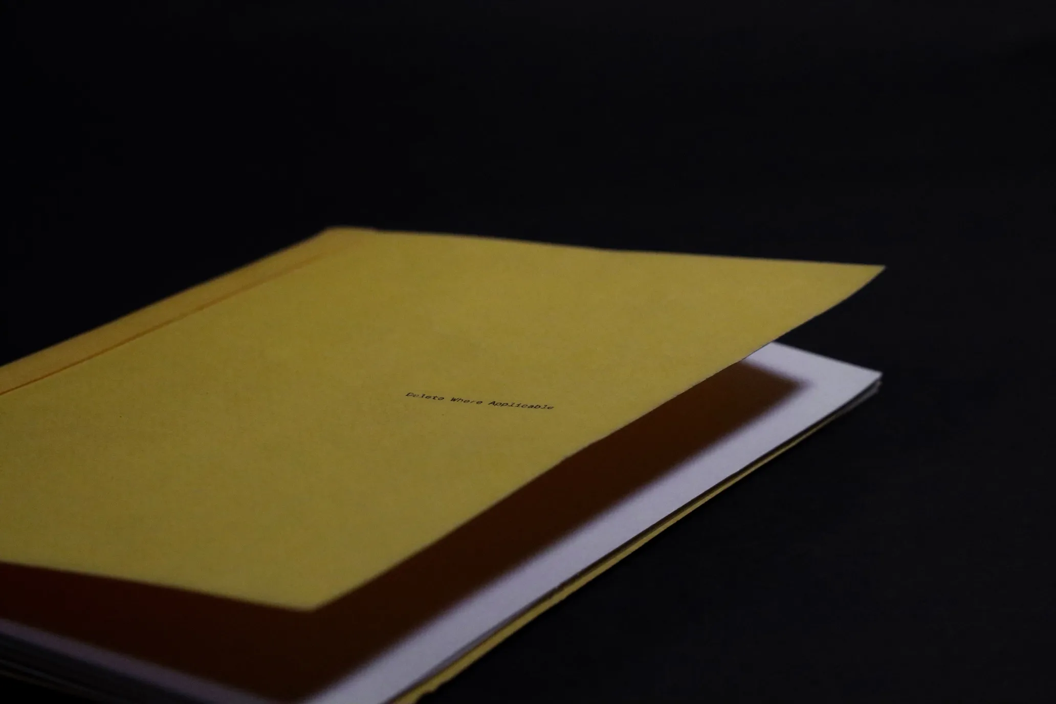

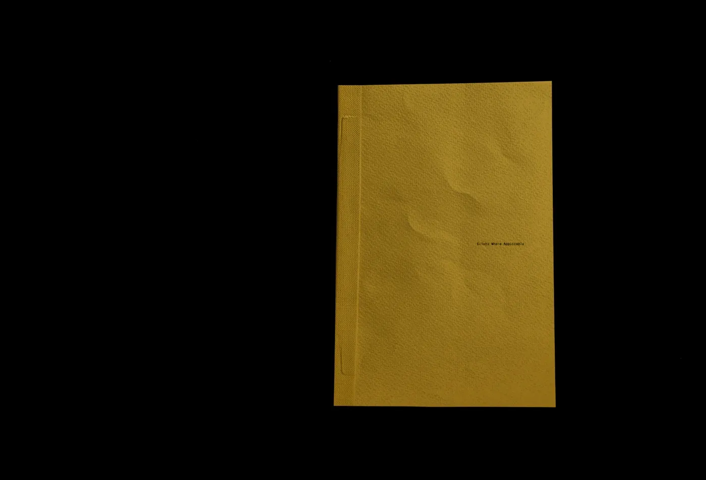
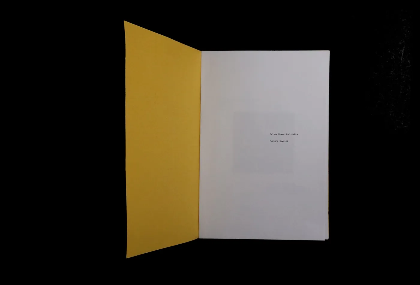
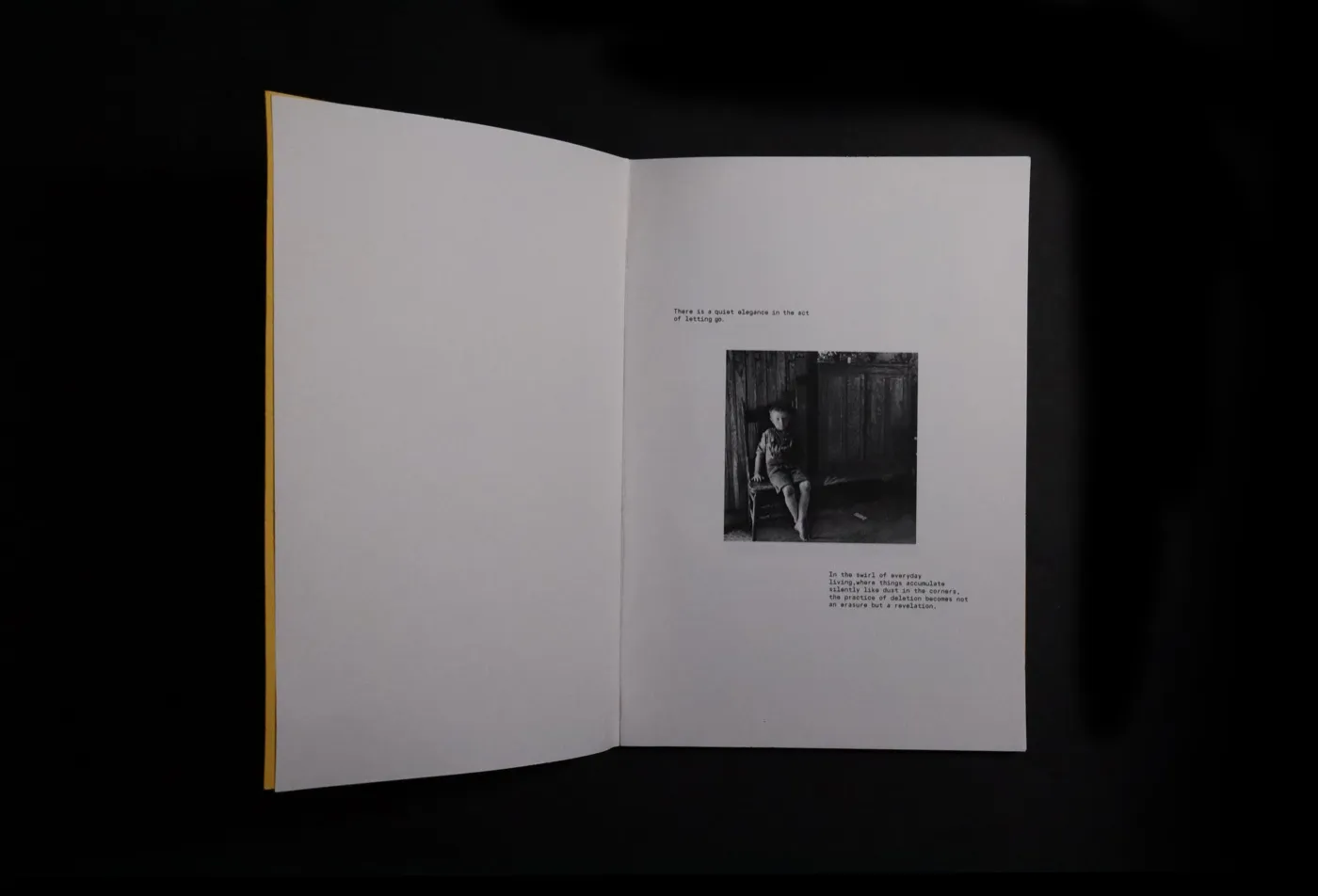
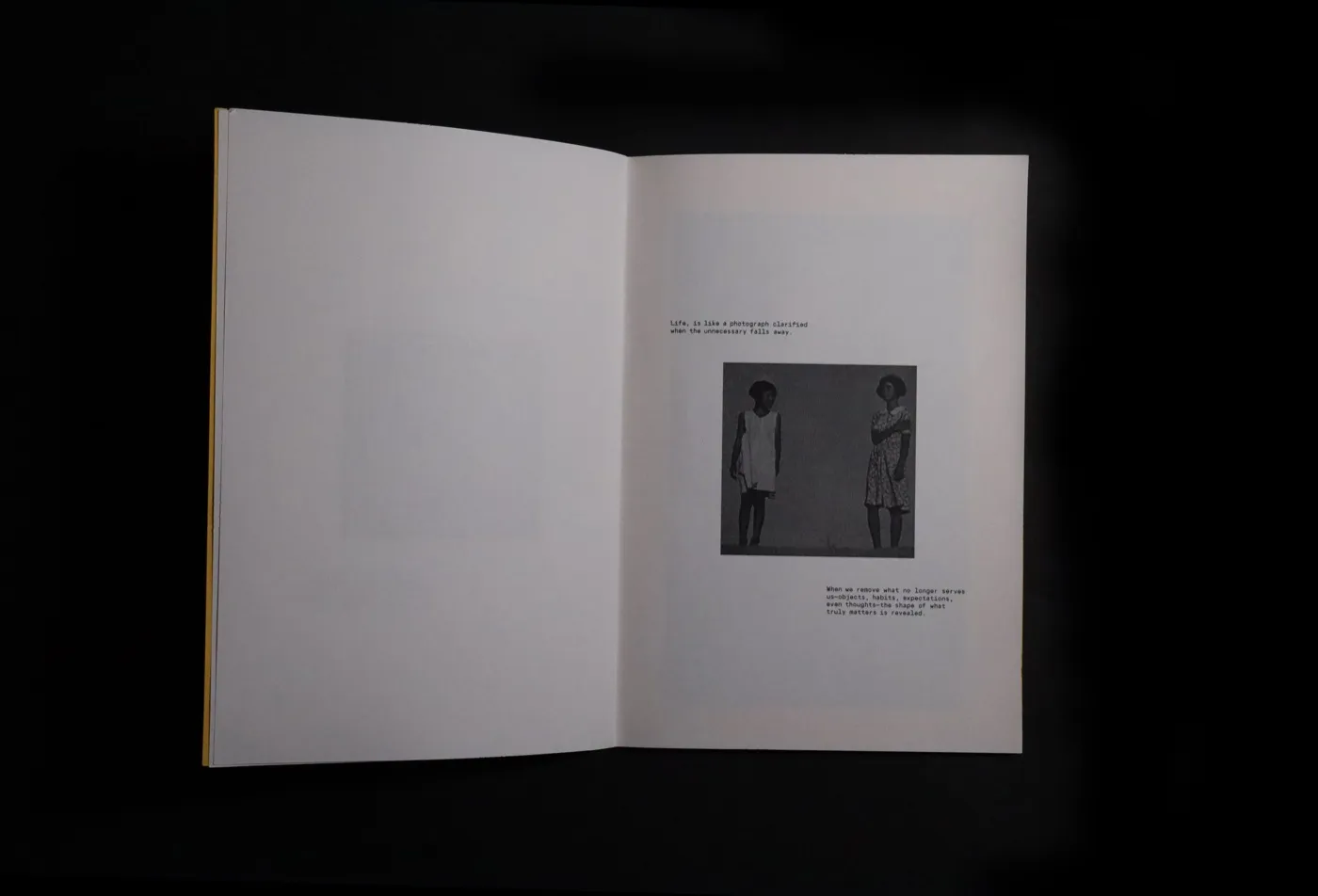
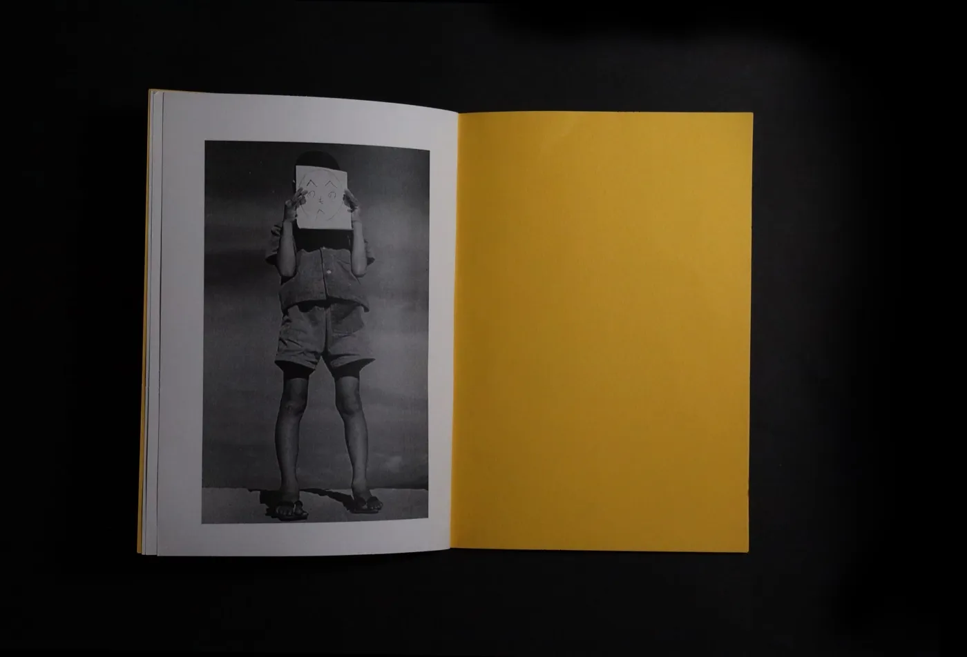
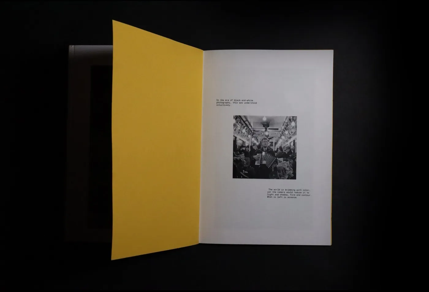
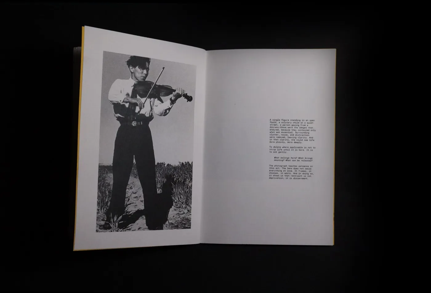
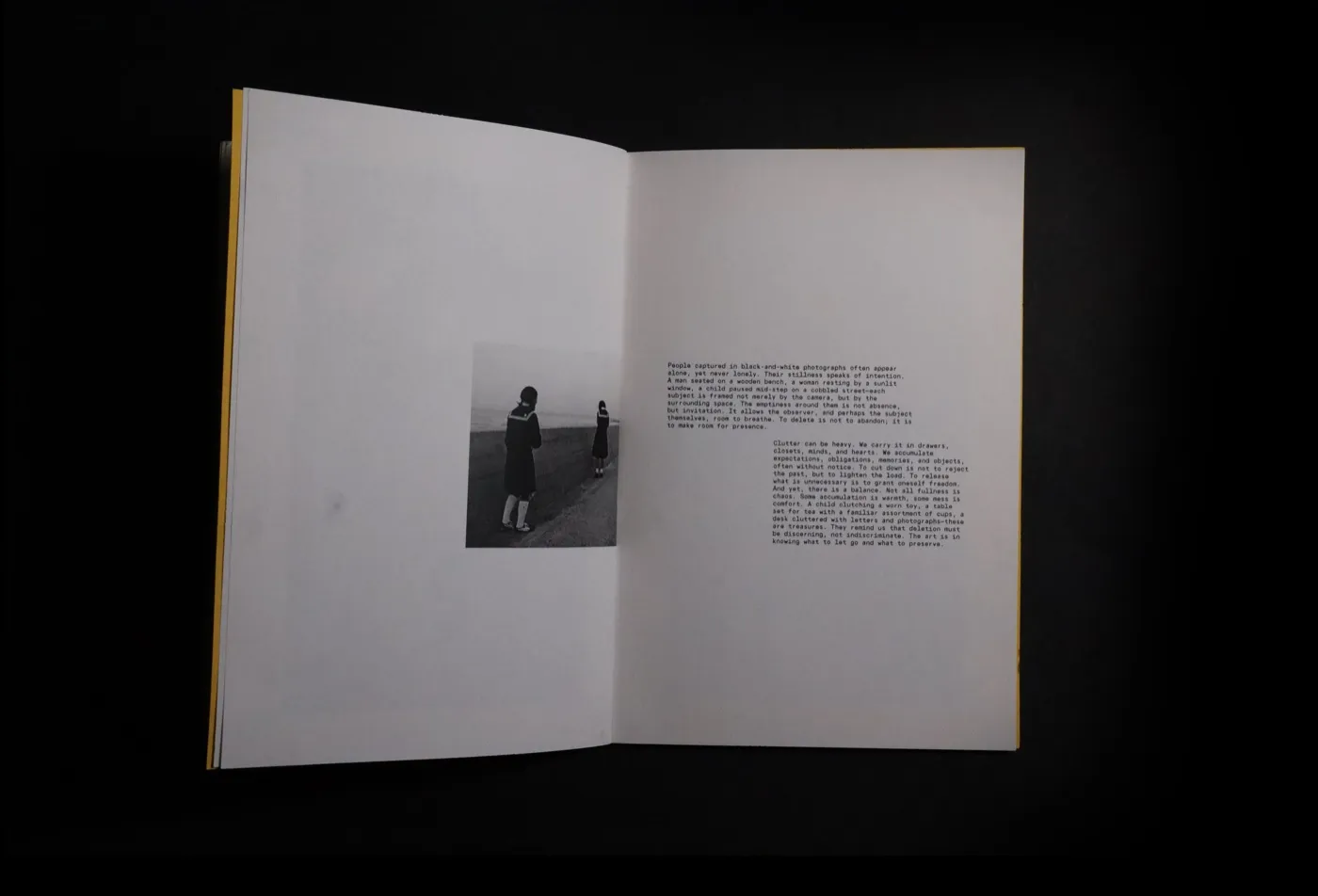
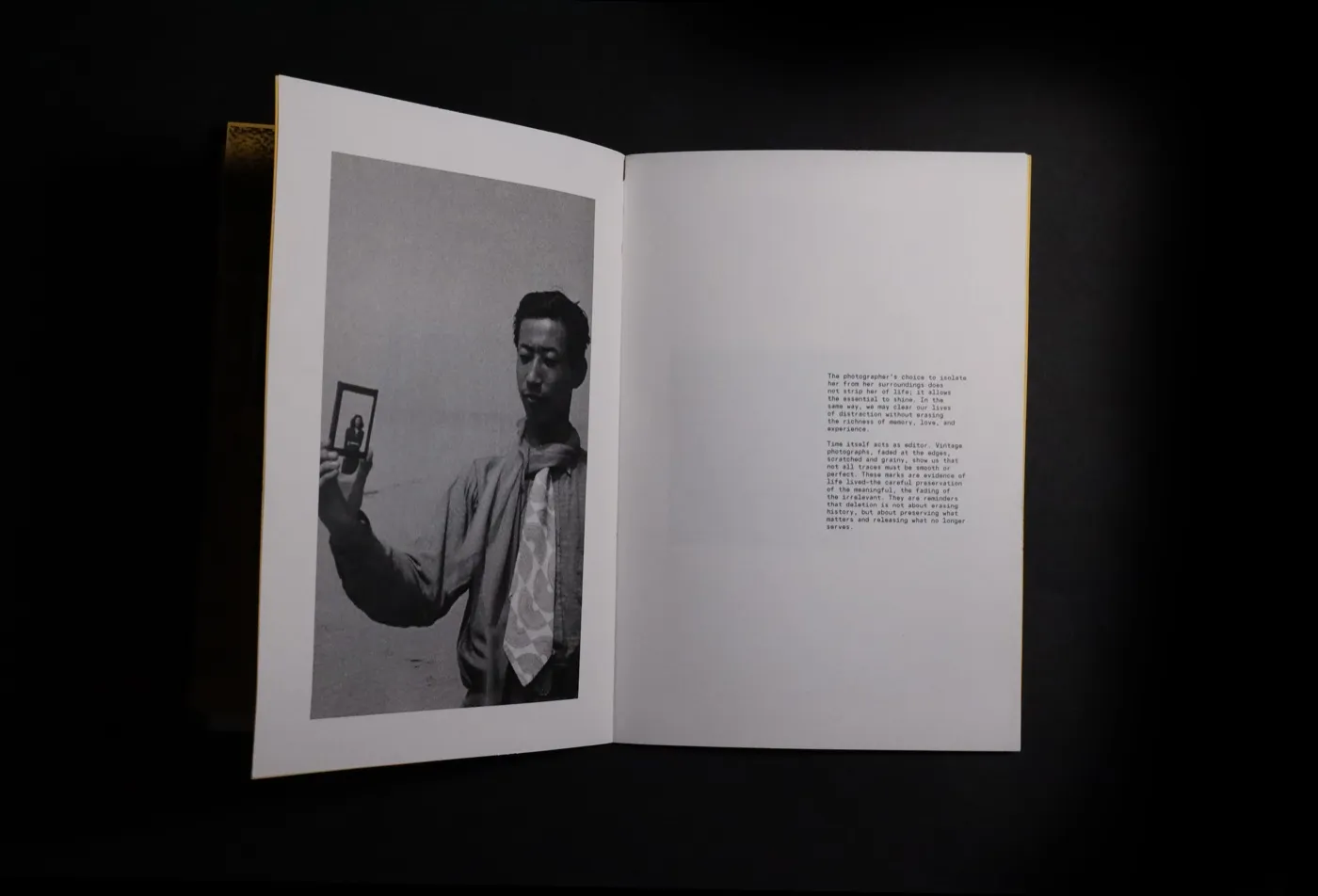
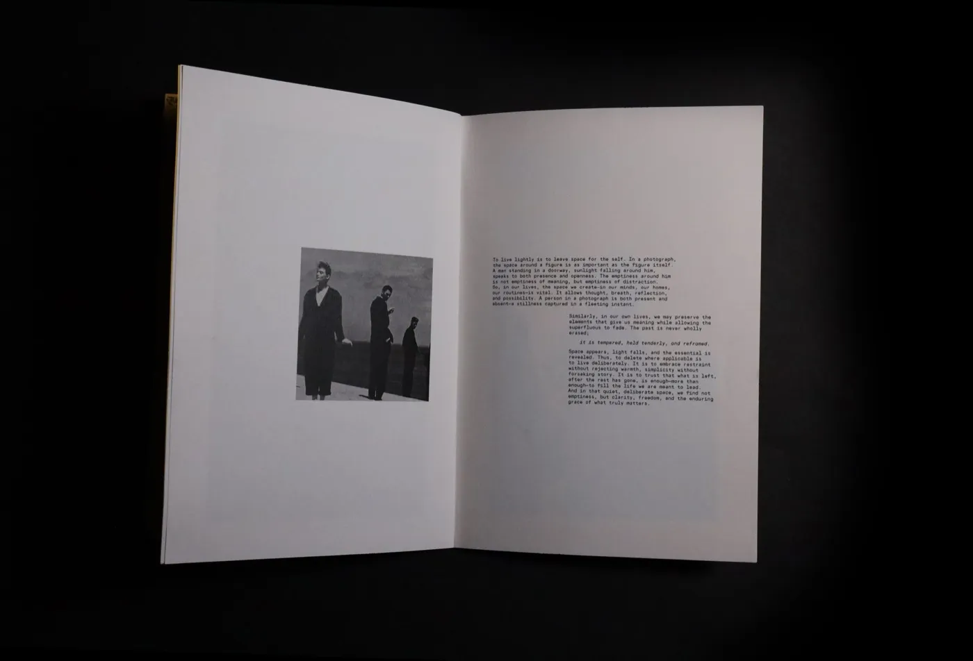
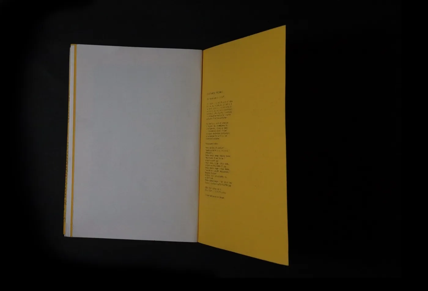
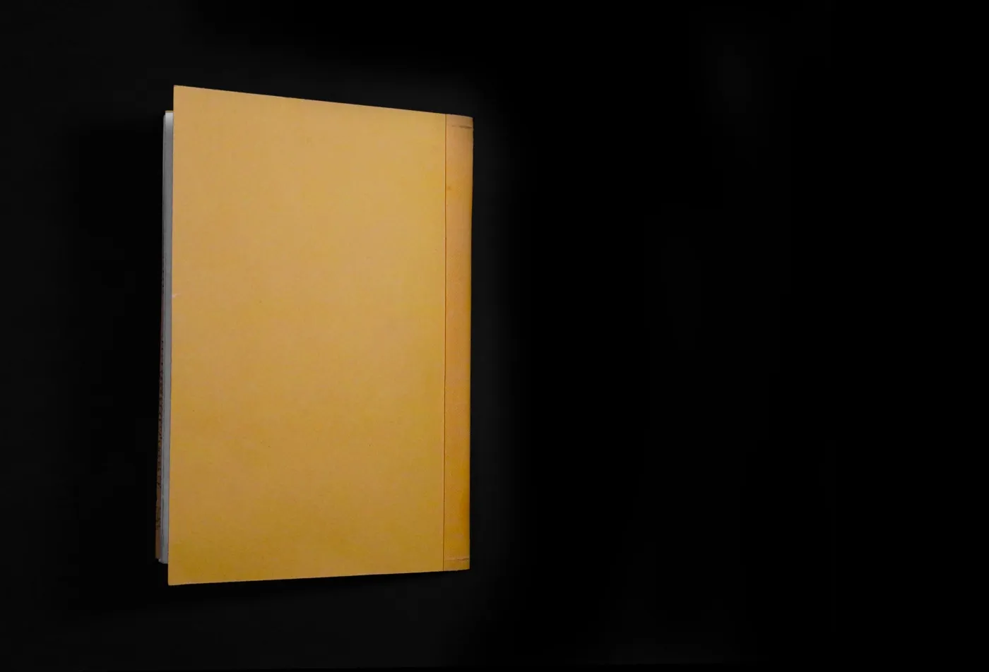
“Delete Where Applicable” was the title that I set eyes on apart from the hundreds of others given. I developed a concept and brought this title to life; a book dedicated to being a pause from the clutter of modern society.
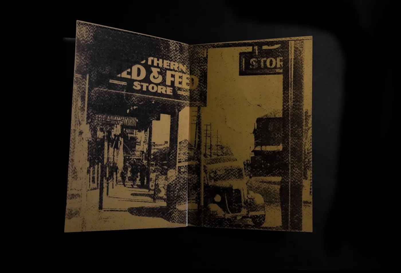
Developing a cohesive story through images, text, and pacing for a physical book was a curve to navigate. Translating a screen-design mindset into a tactile design involved battling the tension between dumping every thought into the book and simplifying it. The book needed to have character whilst keeping the minimalist message without it being too literal. I wanted to keep at least one spread to contrast the idea of minimalism while keeping the elements consistent throughout the whole book.
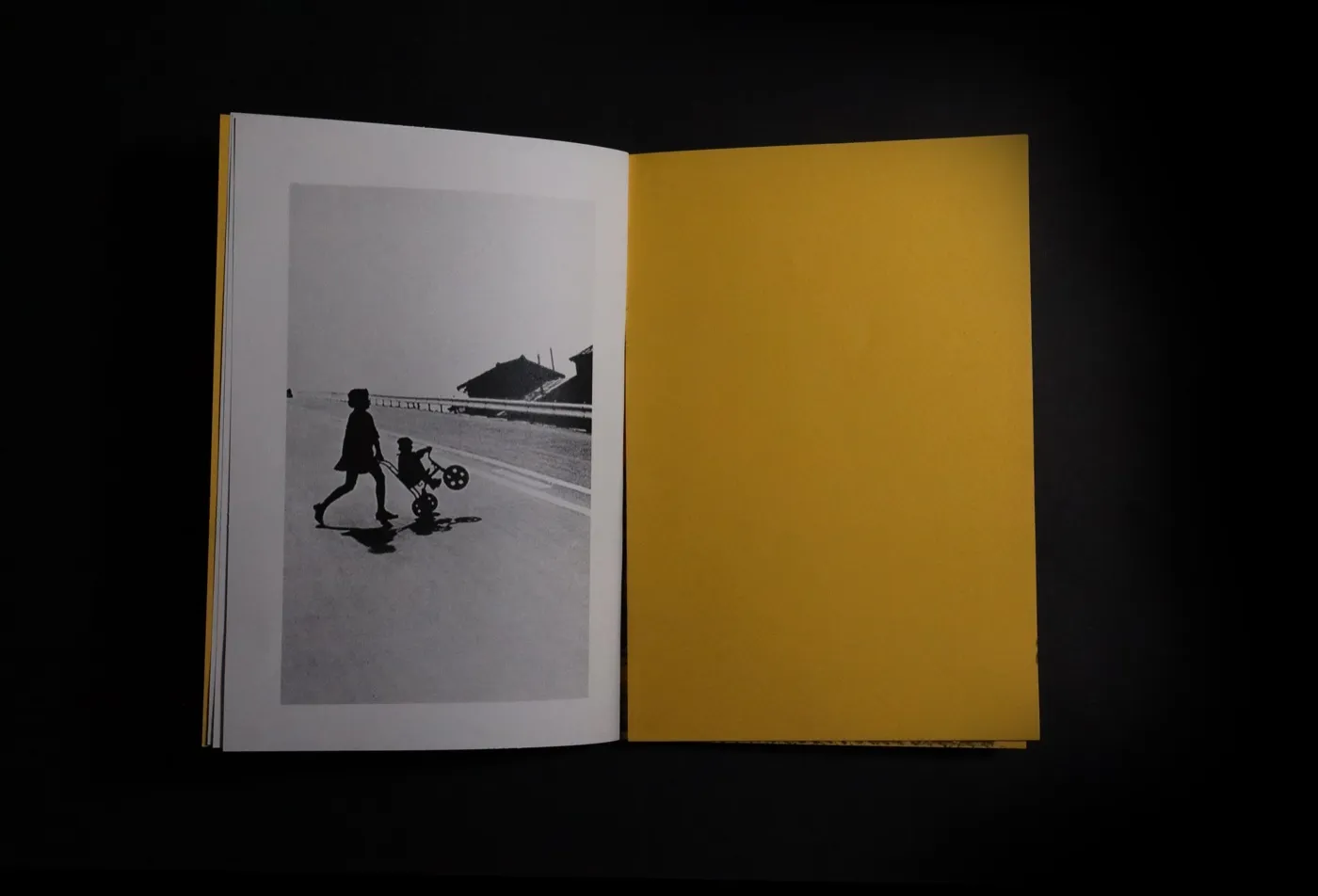
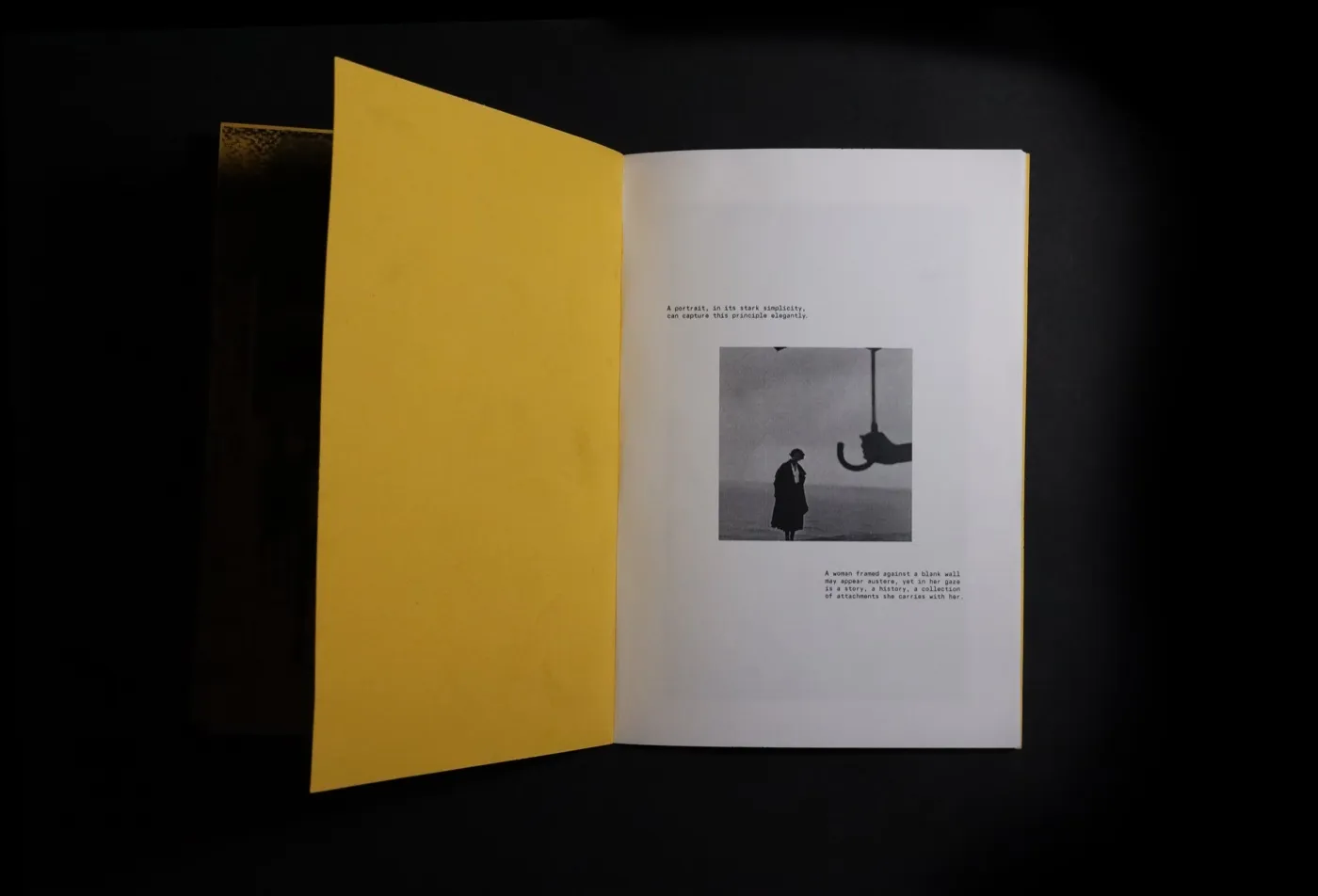
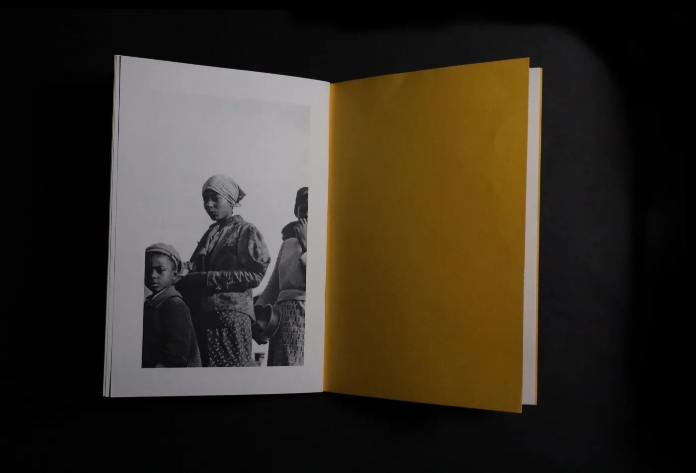
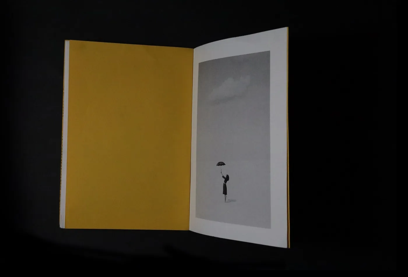
I find myself minimizing wherever I can in life, whether it's the material items I own or connections that no longer bring purpose. When we cut off excess unnecessary weight in our lives, we feel lighter and clearer-minded. The black & white imagery throughout the book embodies this message of reducing to the necessities. Colour, noise, and distraction are gone. What remains is form, light, and subject. The monochrome images don't just illustrate the text; they perform it. In the early to mid 20th century, the luxuries of materialistic wealth were not considered the standard. Consumerism has become a globalized issue, and it even boils down to the technology we use. Everything has become a means of convenience rather than a source of gratitude for the little things in life. The primary subjects are people, ordinary moments, and human connection. When we talk about decluttering, we're usually talking about relationships, expectations, and the emotional weight we carry from others. The photographs quietly hold that truth without stating it. However, excessive decluttering can leave a person feeling lonely and disconnected. As humans, we crave connection and need it to grow; that is why there is one spread highlighting a setting where people come to connect. Deleting where applicable, does not mean deleting everything in life, but where you can.
This book was a petite canvas to work on, a 5.25 x 7.75-in paper. Minimizing the size was intentional to keep only the necessary contents. The fun alignment of the images and text was the most enjoyable part of creating the book's flow and pacing. There are pages in the book where the photo is aligned and sized to the text, but it is only visible when the light hits the page, with the alignment visible as a transparency. Creating the book's pacing allowed for the calmness it implies. Yellow is the most visually “loud” colour, so the minimalism makes the yellow louder. It represents clutter you chose to keep; the joy that wasn’t edited out. The yellow paper contains 45% cotton, which adds texture and makes it engaging to the touch. These fun elements brought the piece together!
By: Rudaina Suwaiba
Using: InDesign + Photoshop
In November of 2025
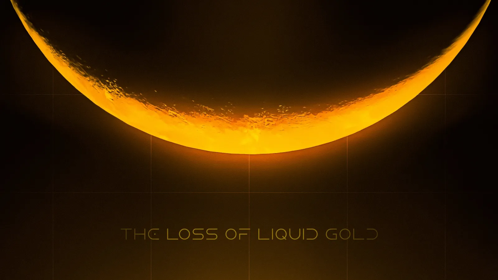
The Loss of Liquid Gold. Common processes that are well known tend to get overlooked. The importance of bees seem to have lost it’s value amongst society. So what if there really was a world where bees no longer existed and no one knew what they were?
Interactive Design
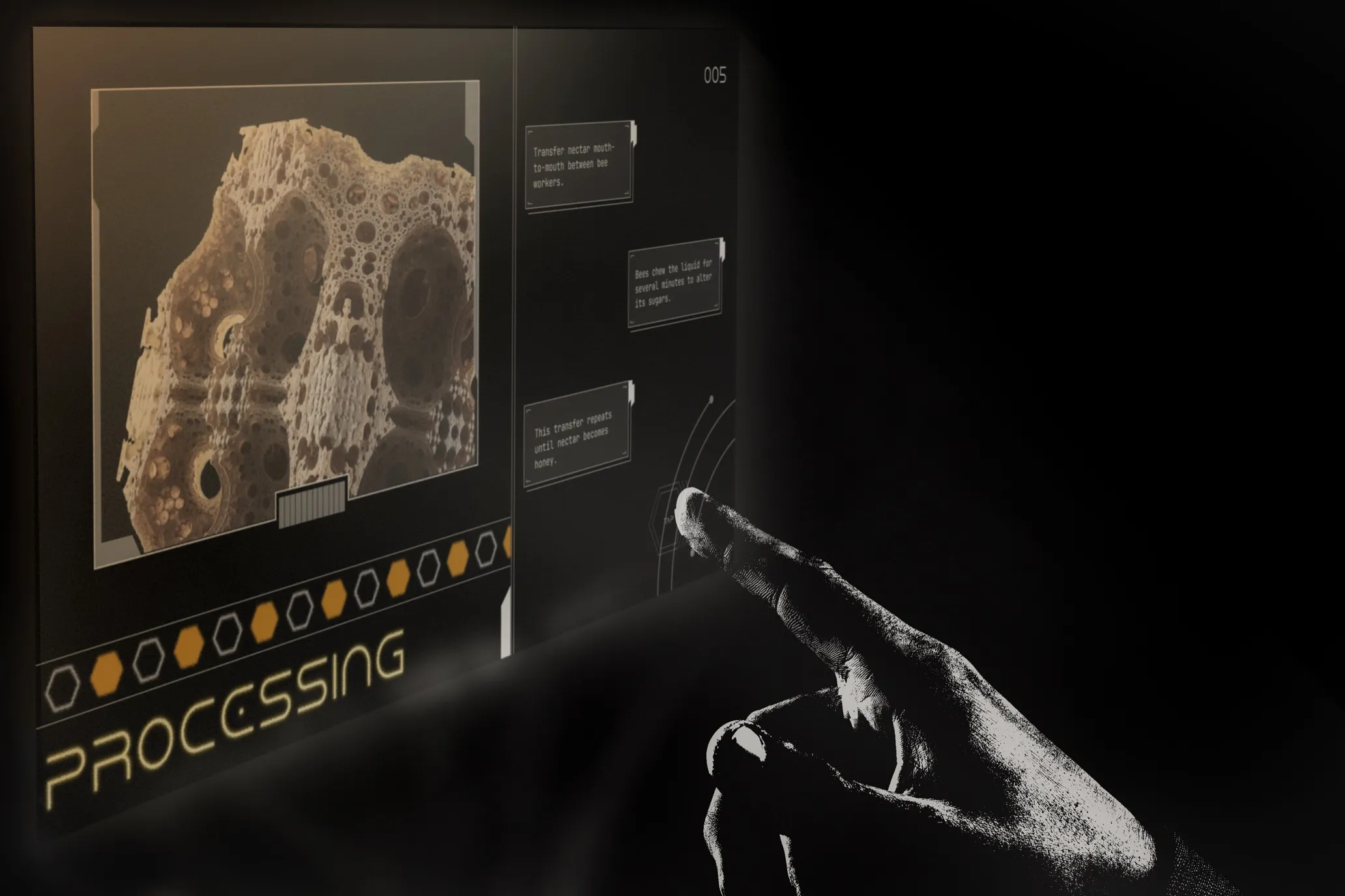
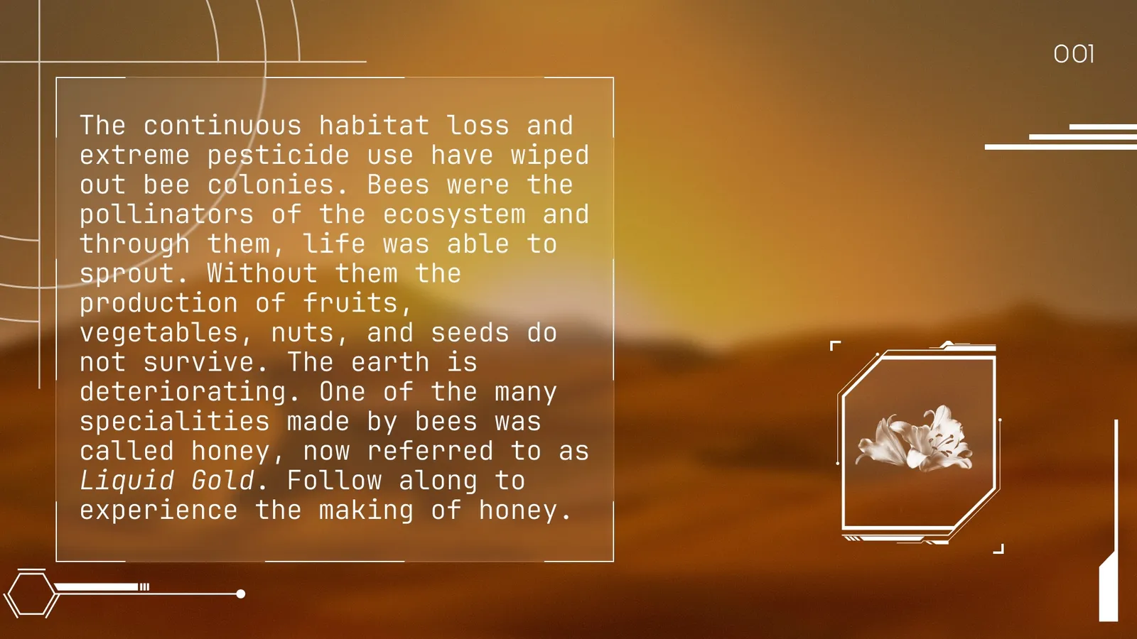
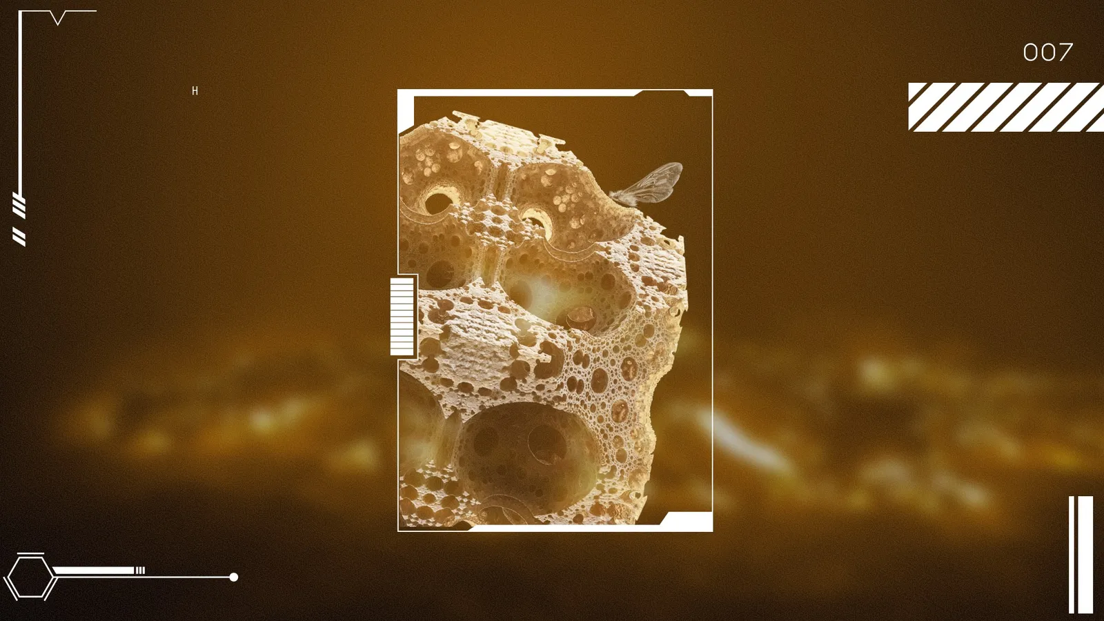
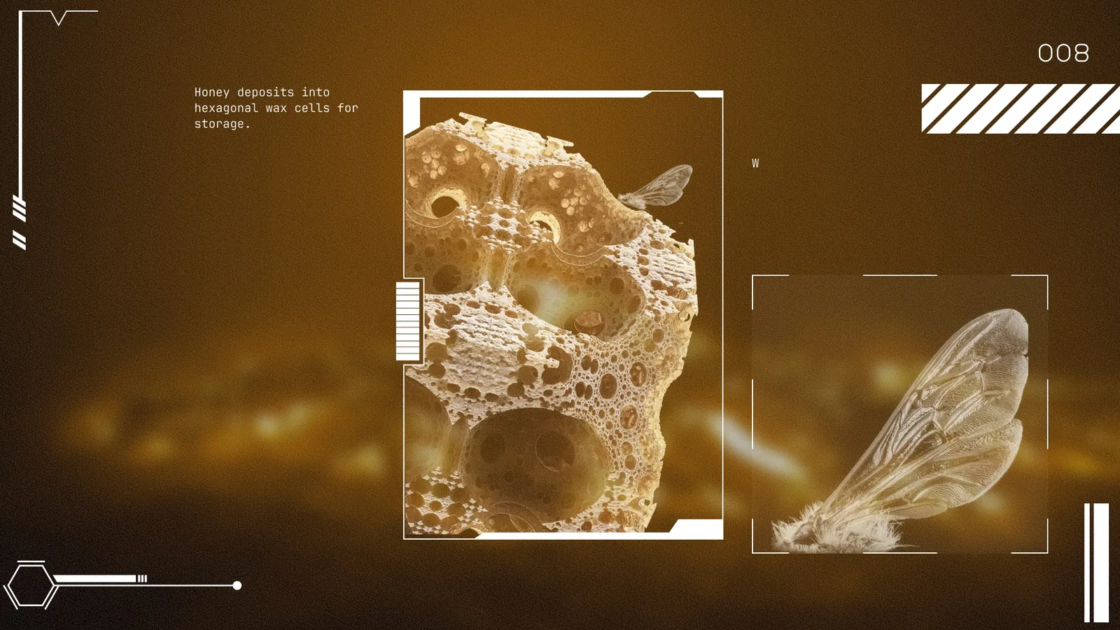
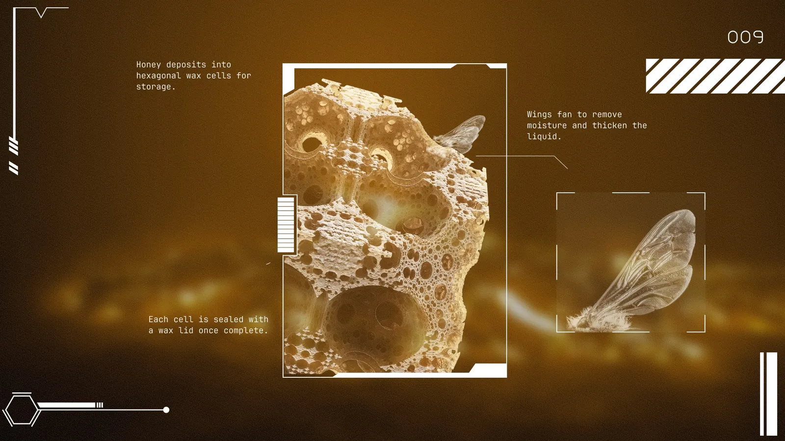
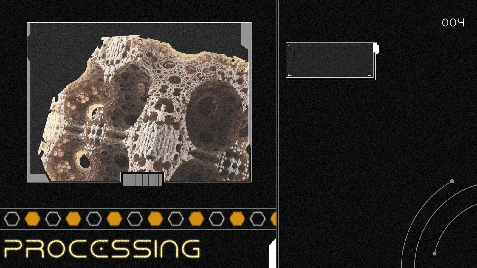
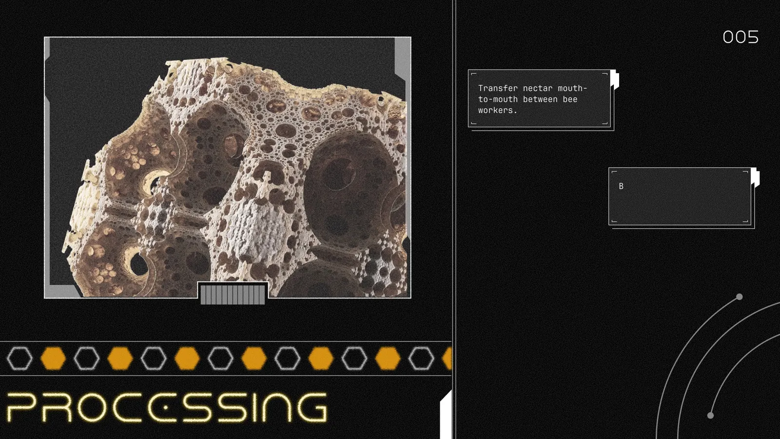
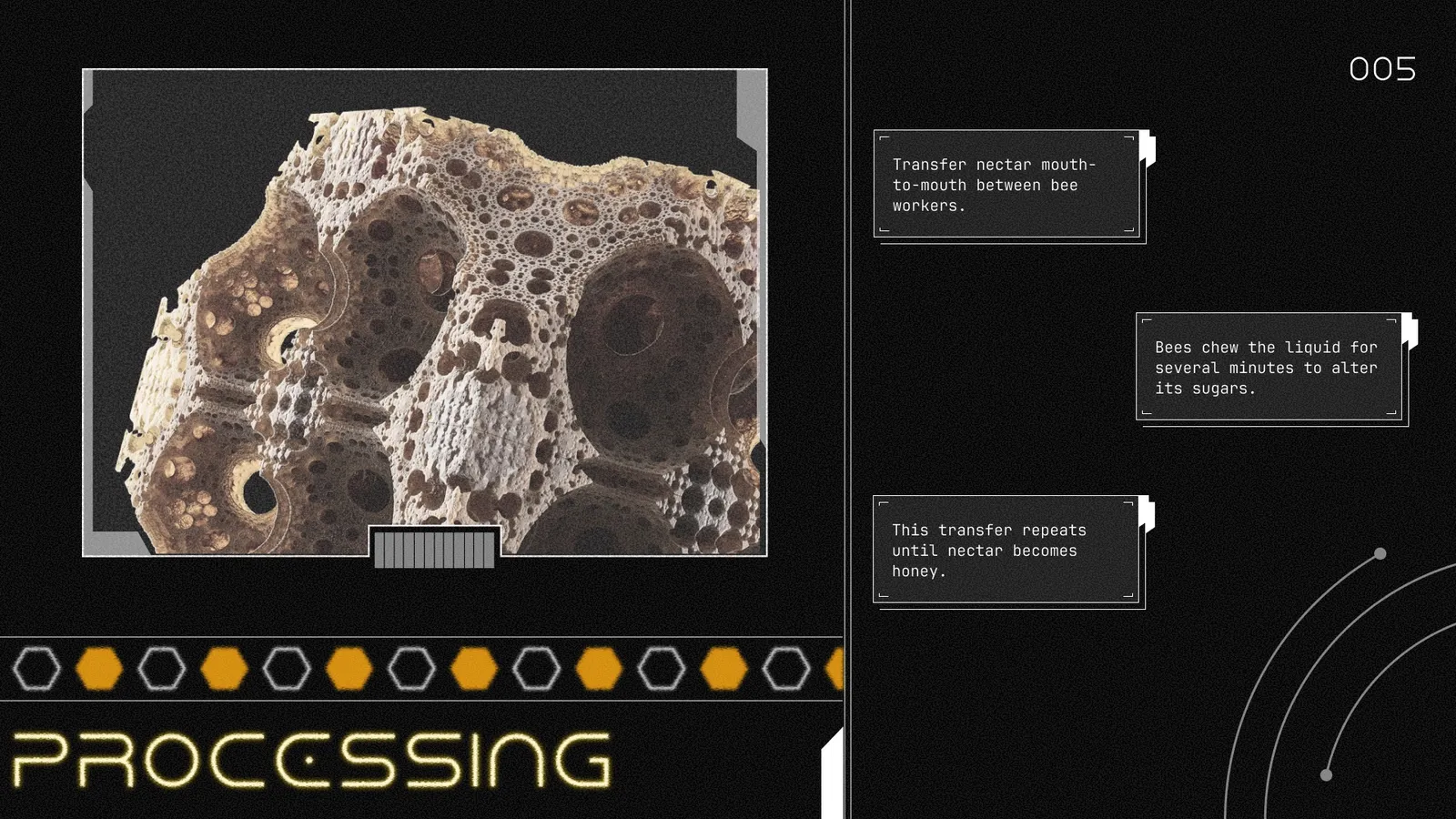
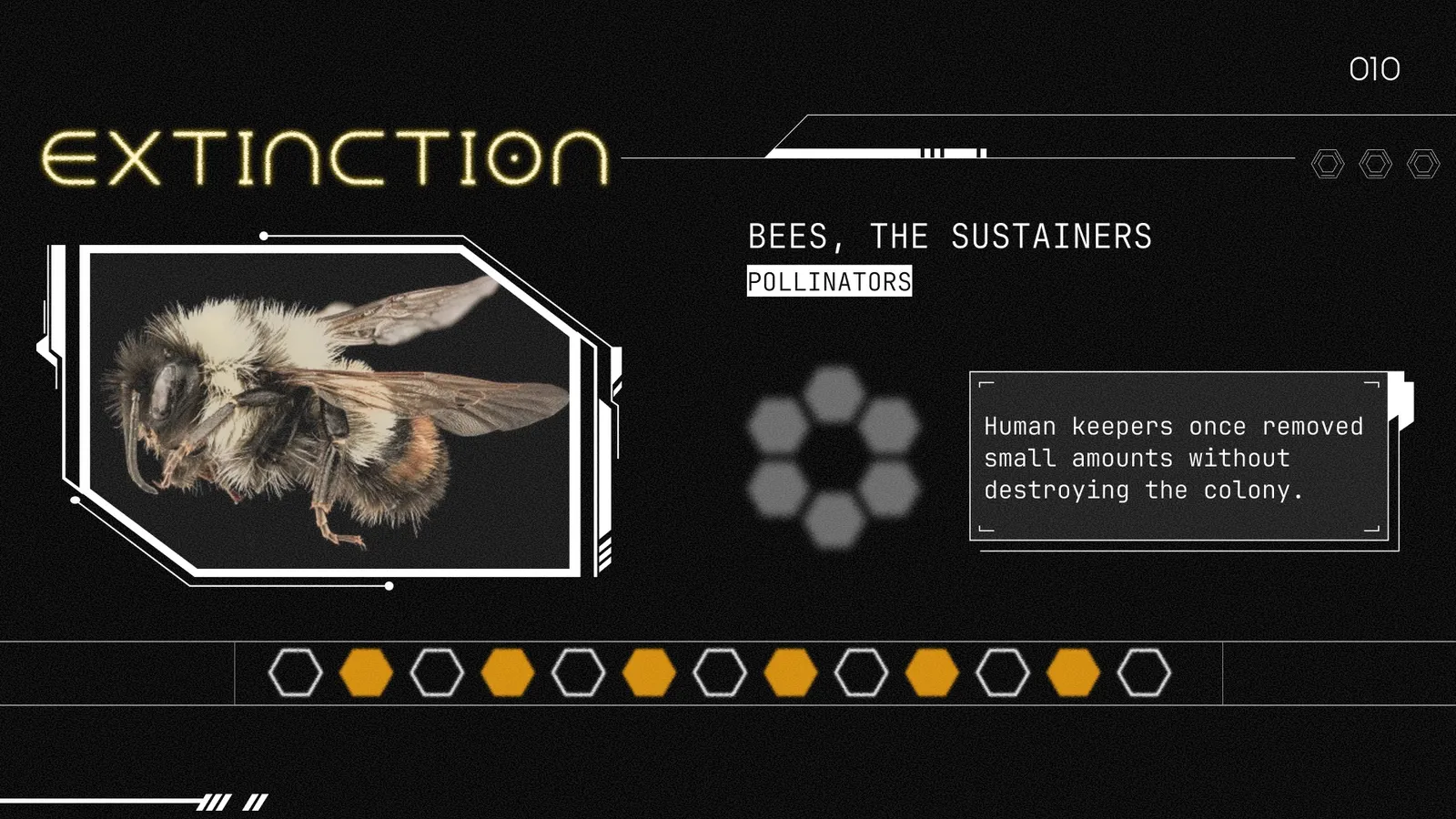
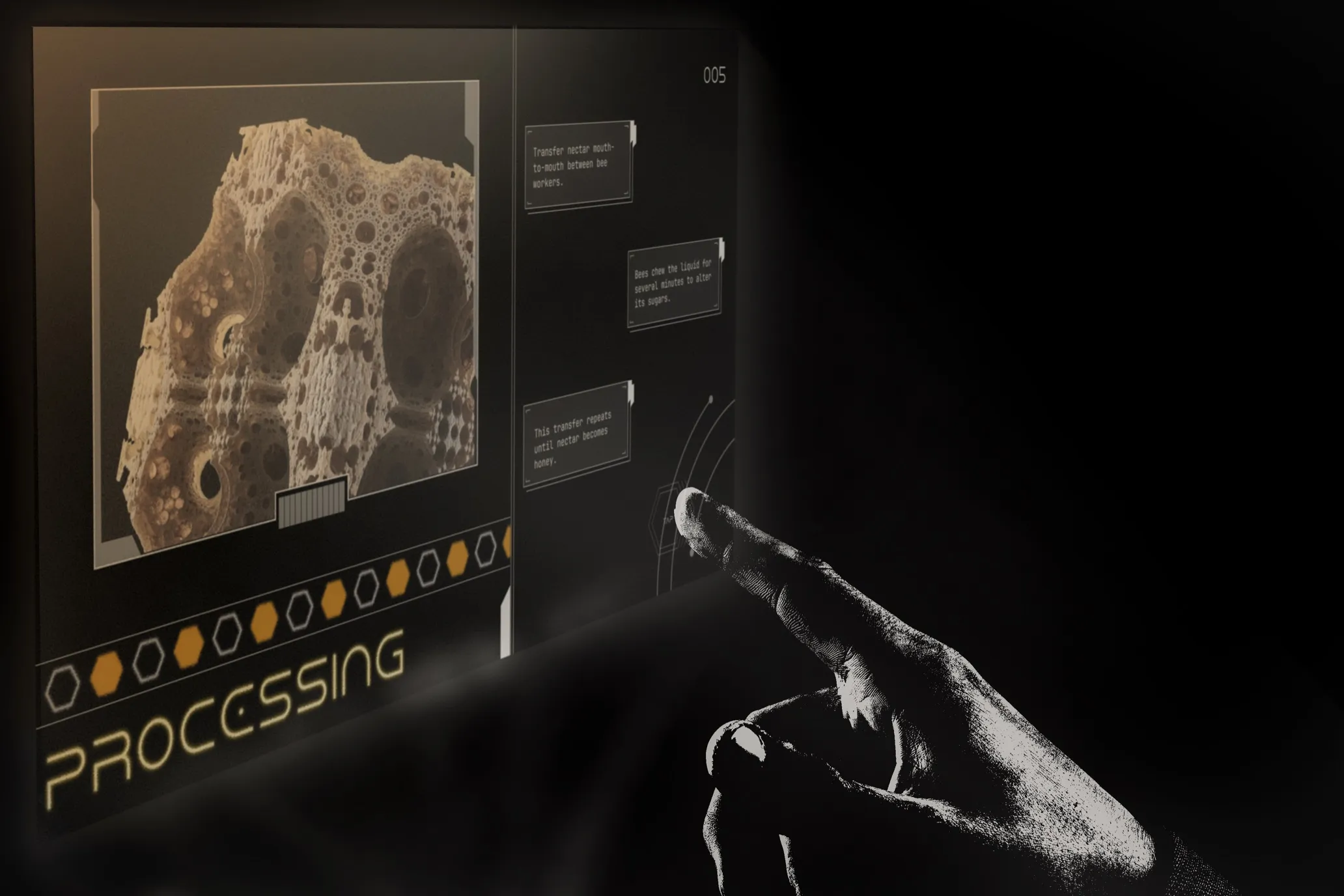
Visualizing information is an effective way to communicate and digest information. This project aimed to visualize processes, specifically how bees make honey, through an interactive interface.
Set in a dystopian future where bees have gone extinct and honey no longer exists. The audience is reframed as people in a futuristic world interacting with a holographic projection device, similar to scrolling on a tablet, learning about something their world has entirely lost.
The brief asked for a process to be broken into clear steps, but a literal explainer felt flat for the subject. Bee extinction isn't just informational; it's a loss. The challenge was building a system that could teach the process of honey-making while making the audience feel its absence.
The whole interface runs on one extended metaphor: honey as liquid gold, light as life. The landing page opens with an eclipse, the sun blocked, since the sun and bees both give life, and losing either signifies their disappearance. The gold light glowing through the eclipse stands in for the honey itself.
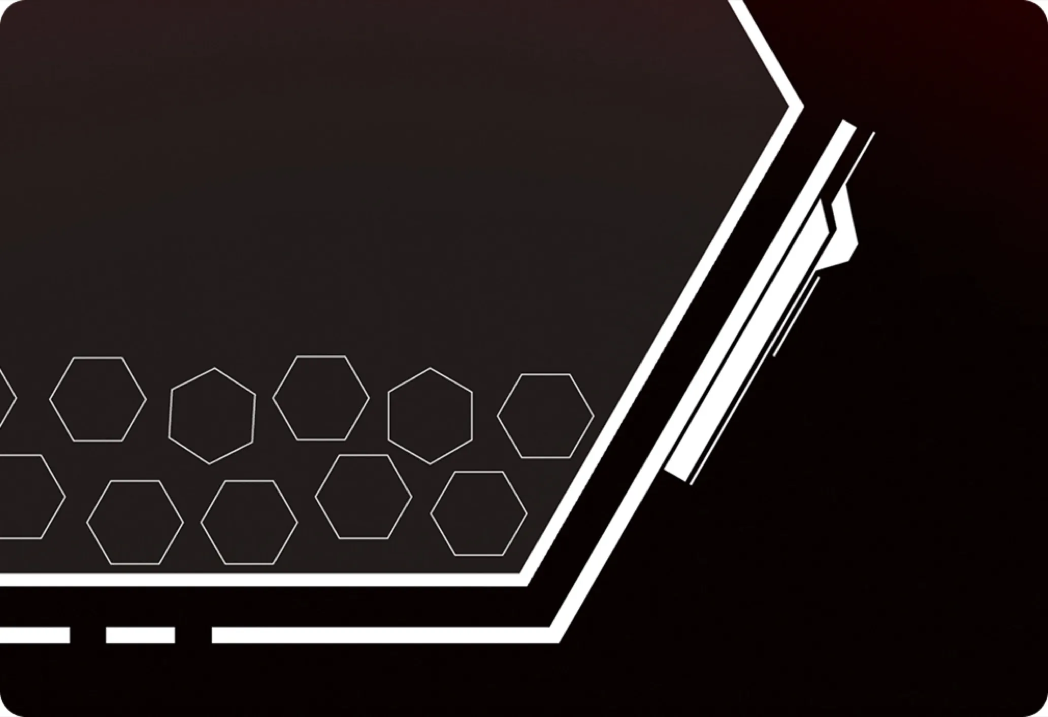
Hexagons are used throughout the story to symbolize the root of the process: a home. Hexagons are full and empty to represent nectar passing from bee to bee. A hexagon at the centre acts as the bee's stomach, storing nectar, the imagery suggesting something almost like a black hole pulling it in. By the end, the hive reappears as a filed report, beekeepers once harvested honey, and the emptying hexagons represent the honey being taken.
Interaction design reinforces the futuristic, tactile world the brief invented. Static electricity animations on key images, typewriter text revealing each step, and small arrow indicators all mimic the gestures of a holographic device, something meant to be tapped and scrolled through by hand.
Colour went through its own rethink. The instinct for sci-fi and holograms is usually cool tones, blacks and whites. Looking to Dune shifted that: deserts are lifeless but warm-toned, and that contrast (warmth representing life, even in a barren setting) fits the honey and bee theme more honestly than the expected cool palette would.
By: Rudaina Suwaiba
Using: Photoshop + Figma
In January of 2026
I am a Toronto-based designer currently in my third-year of Design at York University.
I enjoy collaborating to learn new skills and practice my expertise is graphic design and UI design!
Hope you had a blast looking through my work! The best way to reach me is through my email: [email protected]. :))